Is there a way to make Astrobin.com default to the ‘classic view’ and stay there with each logout/ login cycle?
|
You cannot like this item. Reason: "ANONYMOUS".
You cannot remove your like from this item.
Editing a post is only allowed within 24 hours after creating it.
You cannot Like this post because the topic is closed.
Copy the URL below to share a direct link to this post.
This post cannot be edited using the classic forums editor.
To edit this post, please enable the "New forums experience" in your settings.
me too
there should be an option for this
|
You cannot like this item. Reason: "ANONYMOUS".
You cannot remove your like from this item.
Editing a post is only allowed within 24 hours after creating it.
You cannot Like this post because the topic is closed.
Copy the URL below to share a direct link to this post.
This post cannot be edited using the classic forums editor.
To edit this post, please enable the "New forums experience" in your settings.
Hey guys! The option has been there in your preferences since day one: https://www.astrobin.com/profile/edit/preferences/(last entry in the form) Anyway, what are you missing exactly? If it's something that's missing or worse than before, please let me know so I can fix it. Or, likely, show you why the new layout is better in that regard. If it's just "I'm used to the classic view and I don't want changes", I understand that (that's why the option exists). But you'll be missing out as more and more of AstroBin is migrated to the pages you currently see on the "app".astrobin.com subdomain, and the experience will overall be very cohesive, but, importantly, extremely fast when navigating between pages. Even now you can see that on the search page, you click on next/next/next to see more images in the results, it's super fast. Over the next few weeks/months, the user galleries and home page will also be migrated and being on the old UI will definitely be missing out. Thanks in advance for letting me know if you're missing something in the new UI. Salvatore
|
You cannot like this item. Reason: "ANONYMOUS".
You cannot remove your like from this item.
Editing a post is only allowed within 24 hours after creating it.
You cannot Like this post because the topic is closed.
Copy the URL below to share a direct link to this post.
This post cannot be edited using the classic forums editor.
To edit this post, please enable the "New forums experience" in your settings.
What is this "Classic" view, btw?
|
You cannot like this item. Reason: "ANONYMOUS".
You cannot remove your like from this item.
Editing a post is only allowed within 24 hours after creating it.
You cannot Like this post because the topic is closed.
Copy the URL below to share a direct link to this post.
This post cannot be edited using the classic forums editor.
To edit this post, please enable the "New forums experience" in your settings.
It refers to the regular view of an image, such as this: https://www.astrobin.com/xnzey0/D/compared to the new layout available from the search page, such as this: https://app.astrobin.com/i/xnzey0?r=D |
You cannot like this item. Reason: "ANONYMOUS".
You cannot remove your like from this item.
Editing a post is only allowed within 24 hours after creating it.
You cannot Like this post because the topic is closed.
Copy the URL below to share a direct link to this post.
This post cannot be edited using the classic forums editor.
To edit this post, please enable the "New forums experience" in your settings.
Hi Salvatore, in part it is for sure personal inertia. But I also find the classic view more informative. I have the image and when I scroll down all the information. The new view has its virtues, in particular since I have all essential info on one page, but for example I don't get all the information on the subs or on the framing without clicking subpages - and some info is not avalable at all (e.g. to look at objects in the same area). Matthias
|
You cannot like this item. Reason: "ANONYMOUS".
You cannot remove your like from this item.
Editing a post is only allowed within 24 hours after creating it.
You cannot Like this post because the topic is closed.
Copy the URL below to share a direct link to this post.
This post cannot be edited using the classic forums editor.
To edit this post, please enable the "New forums experience" in your settings.
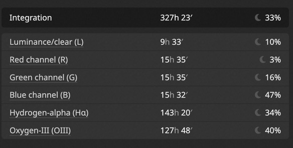
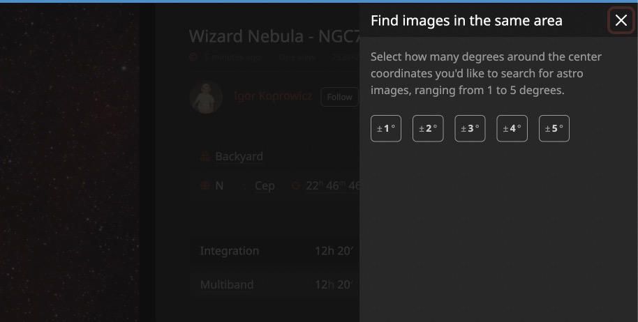
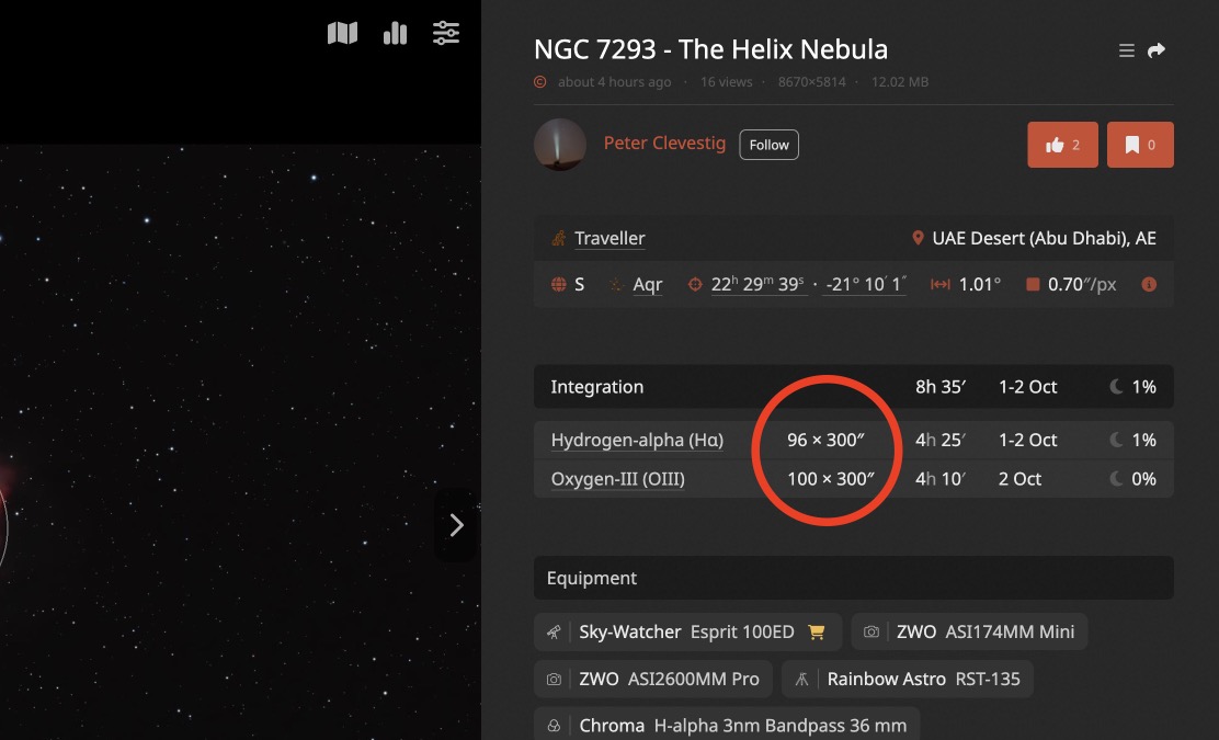
Hi @GalacticRAVE, Which one do you prefer? Classic: 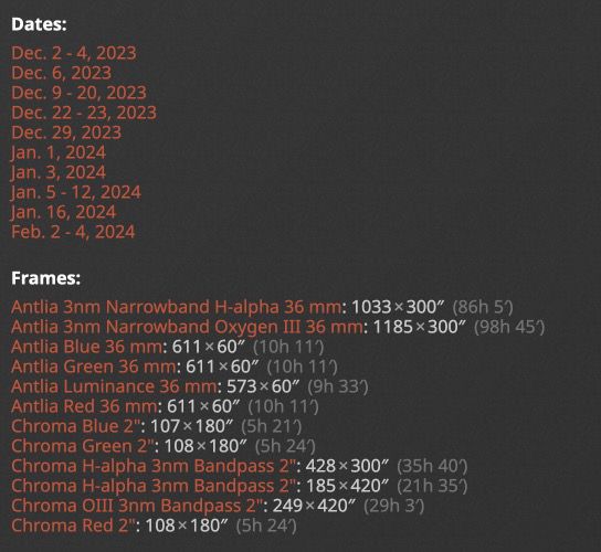 New:  Pros of the Classic: - All available information presented at once Pros of the new: - Information that is most useful (total integration per filter type) more easily readable - Avg. moon illumination per filter type Cons of the Classic: - It gets really messy and unreadably very easily, when you have lots of date and lots of filters Cons of the new: - You have to click to see more details per filter I'm pretty sure that if things were reversed (the classic was the new, and the new was the classic) people would think I was insane to present such a cluttered UI  some info is not avalable at all (e.g. to look at objects in the same area) If you scroll down, they're there without clicking anywhere: 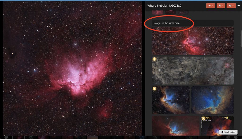 Or, you can click on the RA/dec coordinates (you will notice that they have an underline, to indicate that they are clickable): 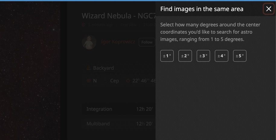 Hope this helps!
|
You cannot like this item. Reason: "ANONYMOUS".
You cannot remove your like from this item.
Editing a post is only allowed within 24 hours after creating it.
You cannot Like this post because the topic is closed.
Copy the URL below to share a direct link to this post.
This post cannot be edited using the classic forums editor.
To edit this post, please enable the "New forums experience" in your settings.
On the coordinates, it would be nice to click on them and see the box you have there, and have a button to copy them to the clipboard. The two values separated with a comma would be very useful.
|
You cannot like this item. Reason: "ANONYMOUS".
You cannot remove your like from this item.
Editing a post is only allowed within 24 hours after creating it.
You cannot Like this post because the topic is closed.
Copy the URL below to share a direct link to this post.
This post cannot be edited using the classic forums editor.
To edit this post, please enable the "New forums experience" in your settings.
@Dark Matters AstrophotographySure, I can do that very easily. I can provide multiple formats, such as decimal, and with symbol separators (h, ', ", °). Is there a specific format you need? I assume you want to paste this into some other software. Can you show me some examples of formats that would work?
|
You cannot like this item. Reason: "ANONYMOUS".
You cannot remove your like from this item.
Editing a post is only allowed within 24 hours after creating it.
You cannot Like this post because the topic is closed.
Copy the URL below to share a direct link to this post.
This post cannot be edited using the classic forums editor.
To edit this post, please enable the "New forums experience" in your settings.
In the preferences section for 'Enable new search experience' I selected 'No' and then clicked on 'save'. When I do a new search and click on a photo I immediately see the 'new' format again. When I go back to preferences the 'Enable new search experience' has defaulted back to 'Yes'. I have tried this several times with the same result, new search is always selected to 'yes'. However, when I select any of my own images I always get the 'Classic view' even when the new search experience is selected to 'yes'. Thoughts?
|
You cannot like this item. Reason: "ANONYMOUS".
You cannot remove your like from this item.
Editing a post is only allowed within 24 hours after creating it.
You cannot Like this post because the topic is closed.
Copy the URL below to share a direct link to this post.
This post cannot be edited using the classic forums editor.
To edit this post, please enable the "New forums experience" in your settings.
I like the way the classic view looks in regards to the exposure details it doesn't seem messy to me; I like the Classic, because, with the new layout, you don't know if an image is, for example, 10 hours made up of 10 minute subs, or 10 hours made up of 10 second subs, and the exposure time is one of the first things I look at after viewing the image; perhaps it's not important, I'm just different I guess. anyway, Sal says there is a setting to make Classic view default; @goodeye, I found it and turned it on and it's working for all images (mine and others)
|
You cannot like this item. Reason: "ANONYMOUS".
You cannot remove your like from this item.
Editing a post is only allowed within 24 hours after creating it.
You cannot Like this post because the topic is closed.
Copy the URL below to share a direct link to this post.
This post cannot be edited using the classic forums editor.
To edit this post, please enable the "New forums experience" in your settings.
it doesn't seem messy to me; I like the Classic, because, with the new layout, you don't know if an image is, for example, 10 hours made up of 10 minute subs, or 10 hours made up of 10 second subs, and the exposure time is one of the first things I look at after viewing the image; perhaps it's not important, I'm just different I guess. I understand that, it is important information of course. The reason it's like that, with totals grouped by filter types, is to avoid the list blowing up to being unreadable if you have lots of sessions. What use is seeing the below right away? 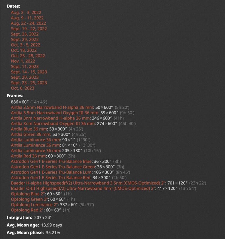 Again, all this information *is* available, you just need to click one of the filter types. But this gives me an idea: when there is a single set, or sets with the same durations (e.g. one day 10x300 and another day 20x200) I can display that right away. The majority of images should be like that. If there's a mixed bag of session durations, then I can display an icon to indicate that, that you can click or hover to show the details. In the preferences section for 'Enable new search experience' I selected 'No' and then clicked on 'save'. When I do a new search and click on a photo I immediately see the 'new' format again. When I go back to preferences the 'Enable new search experience' has defaulted back to 'Yes'. I have tried this several times with the same result, new search is always selected to 'yes'. However, when I select any of my own images I always get the 'Classic view' even when the new search experience is selected to 'yes'. Thoughts? Seems like your form didn't save. Perhaps there was an error message? It's unlikely that AstroBin told you the form was saved but it was not... Anyway I just applied the setting you want manually to your profile.
|
You cannot like this item. Reason: "ANONYMOUS".
You cannot remove your like from this item.
Editing a post is only allowed within 24 hours after creating it.
You cannot Like this post because the topic is closed.
Copy the URL below to share a direct link to this post.
This post cannot be edited using the classic forums editor.
To edit this post, please enable the "New forums experience" in your settings.
I didn't notice an error message but anyway it's all back to Classic view now. Thanks for the help! I just like the classic view better, seems easier to navigate.
|
You cannot like this item. Reason: "ANONYMOUS".
You cannot remove your like from this item.
Editing a post is only allowed within 24 hours after creating it.
You cannot Like this post because the topic is closed.
Copy the URL below to share a direct link to this post.
This post cannot be edited using the classic forums editor.
To edit this post, please enable the "New forums experience" in your settings.
with the new layout, you don't know if an image is, for example, 10 hours made up of 10 minute subs, or 10 hours made up of 10 second subs, As I thought, the vast majority of images is made up of a single exposure duration per filter type, so it's really easy to just display that, or an icon when it's a mix of multiple durations and they cannot be displayed without messing up the readability of the table. So this is coming up later today: 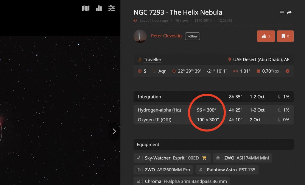 Thanks for the feedback which led to this idea!
|
You cannot like this item. Reason: "ANONYMOUS".
You cannot remove your like from this item.
Editing a post is only allowed within 24 hours after creating it.
You cannot Like this post because the topic is closed.
Copy the URL below to share a direct link to this post.
This post cannot be edited using the classic forums editor.
To edit this post, please enable the "New forums experience" in your settings.
Salvatore Iovene:
@Dark Matters Astrophotography
Sure, I can do that very easily. I can provide multiple formats, such as decimal, and with symbol separators (h, ', ", °).
Is there a specific format you need? I assume you want to paste this into some other software. Can you show me some examples of formats that would work? Sure here is the format I would use with this feature in Voyager: 00 42 44.330, +41 16 7.50
|
You cannot like this item. Reason: "ANONYMOUS".
You cannot remove your like from this item.
Editing a post is only allowed within 24 hours after creating it.
You cannot Like this post because the topic is closed.
Copy the URL below to share a direct link to this post.
This post cannot be edited using the classic forums editor.
To edit this post, please enable the "New forums experience" in your settings.
Dark Matters Astrophotography:
Sure here is the format I would use with this feature in Voyager:
00 42 44.330, +41 16 7.50 It's done! Available in the panel that opens when you click on the coordinates |
You cannot like this item. Reason: "ANONYMOUS".
You cannot remove your like from this item.
Editing a post is only allowed within 24 hours after creating it.
You cannot Like this post because the topic is closed.
Copy the URL below to share a direct link to this post.
This post cannot be edited using the classic forums editor.
To edit this post, please enable the "New forums experience" in your settings.
Salvatore Iovene:
Dark Matters Astrophotography:
Sure here is the format I would use with this feature in Voyager:
00 42 44.330, +41 16 7.50
It's done! Available in the panel that opens when you click on the coordinates Awesome, just used this for a few projects. Thanks for adding so quickly.
|
You cannot like this item. Reason: "ANONYMOUS".
You cannot remove your like from this item.
Editing a post is only allowed within 24 hours after creating it.
You cannot Like this post because the topic is closed.
Copy the URL below to share a direct link to this post.
This post cannot be edited using the classic forums editor.
To edit this post, please enable the "New forums experience" in your settings.
Salvatore Iovene:
with the new layout, you don't know if an image is, for example, 10 hours made up of 10 minute subs, or 10 hours made up of 10 second subs,
As I thought, the vast majority of images is made up of a single exposure duration per filter type, so it's really easy to just display that, or an icon when it's a mix of multiple durations and they cannot be displayed without messing up the readability of the table.
So this is coming up later today:
Thanks for the feedback which led to this idea! thank you, that would be much better
|
You cannot like this item. Reason: "ANONYMOUS".
You cannot remove your like from this item.
Editing a post is only allowed within 24 hours after creating it.
You cannot Like this post because the topic is closed.
Copy the URL below to share a direct link to this post.
This post cannot be edited using the classic forums editor.
To edit this post, please enable the "New forums experience" in your settings.
It’s there now, @messierman3000 |
You cannot like this item. Reason: "ANONYMOUS".
You cannot remove your like from this item.
Editing a post is only allowed within 24 hours after creating it.
You cannot Like this post because the topic is closed.
Copy the URL below to share a direct link to this post.
This post cannot be edited using the classic forums editor.
To edit this post, please enable the "New forums experience" in your settings.
Salvatore Iovene:
It’s there now, @messierman3000 you're very quick! thank you! now I like the new version better than the Classic.
|
You cannot like this item. Reason: "ANONYMOUS".
You cannot remove your like from this item.
Editing a post is only allowed within 24 hours after creating it.
You cannot Like this post because the topic is closed.
Copy the URL below to share a direct link to this post.
This post cannot be edited using the classic forums editor.
To edit this post, please enable the "New forums experience" in your settings.
It’s undeniably better for multiple reasons 😅
|
You cannot like this item. Reason: "ANONYMOUS".
You cannot remove your like from this item.
Editing a post is only allowed within 24 hours after creating it.
You cannot Like this post because the topic is closed.
Copy the URL below to share a direct link to this post.
This post cannot be edited using the classic forums editor.
To edit this post, please enable the "New forums experience" in your settings.
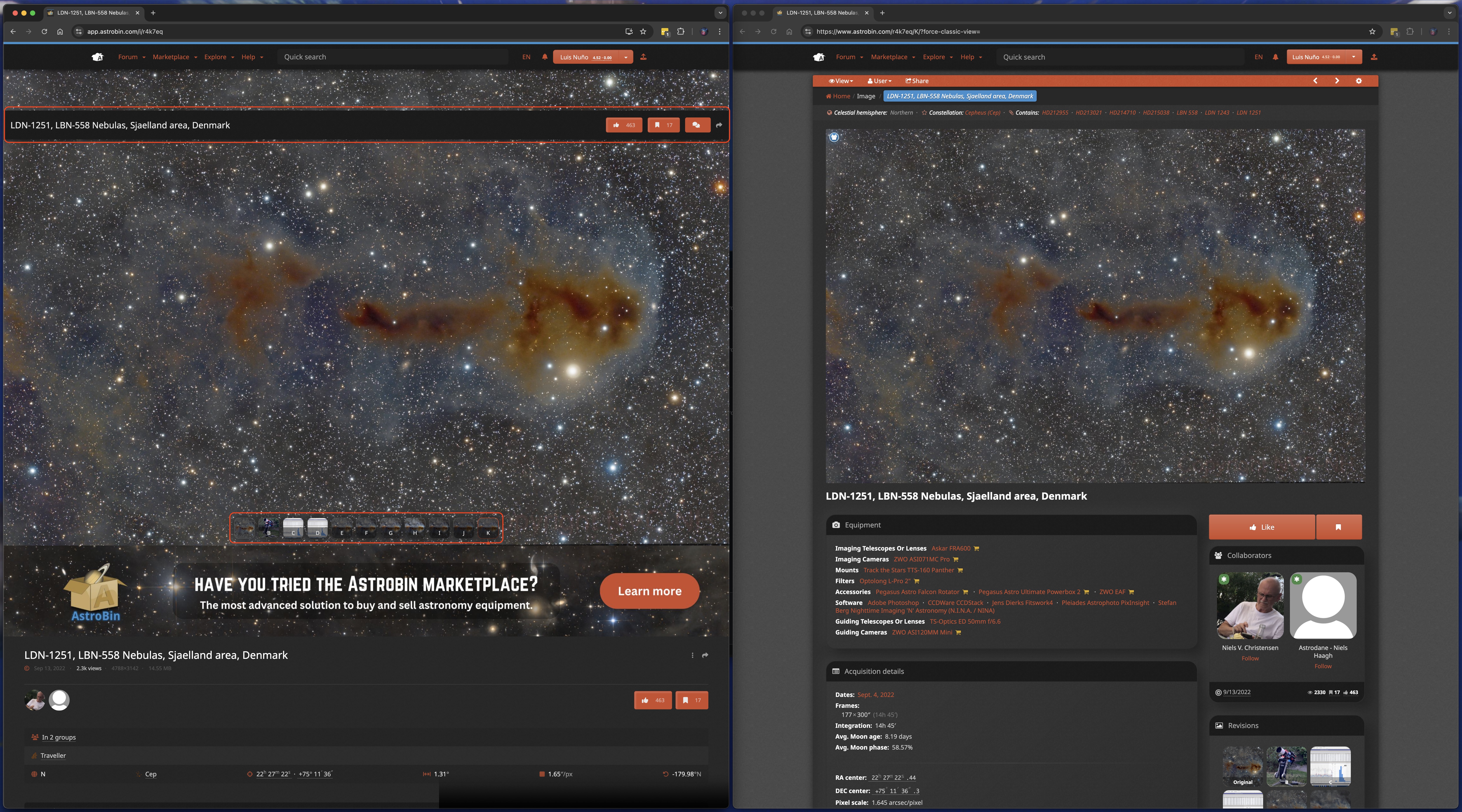
Oh it is good to know there is a way to set the Classic View as default, I personally prefer that view instead of the new one. I like to see all the Acquisition/Integration details as well as the Sky plot at once with no additional clicks. One thing that I personally don't like on the new layout is the title bar with the "Like", "Bookmark" and "Comments" buttons covering some part of the image, same thing with the Revisions at the bottom. I have a wide screen monitor and I split it vertically to accommodate 2 windows and this is how it looks like: 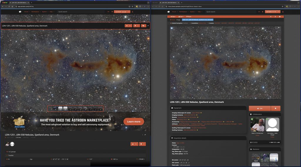 The title is also displayed just below the image, as well as those buttons, so I don't understand why putting them over the image as well. Anyway, it is just my personal opinion and I hope the option of keeping the Classic View is not removed anytime soon. Thanks!
|
You cannot like this item. Reason: "ANONYMOUS".
You cannot remove your like from this item.
Editing a post is only allowed within 24 hours after creating it.
You cannot Like this post because the topic is closed.
Copy the URL below to share a direct link to this post.
This post cannot be edited using the classic forums editor.
To edit this post, please enable the "New forums experience" in your settings.
Hi Luis,
that bar should not be there at that screen resolution, definitely a bug! I’ll fix it in the morning!
|
You cannot like this item. Reason: "ANONYMOUS".
You cannot remove your like from this item.
Editing a post is only allowed within 24 hours after creating it.
You cannot Like this post because the topic is closed.
Copy the URL below to share a direct link to this post.
This post cannot be edited using the classic forums editor.
To edit this post, please enable the "New forums experience" in your settings.