I am curious about any solutions or experiences others might have had with color. I had a recent, and unresolved issue with color reproduction of an image I wanted to print at a commercial outfit. At this outfit, I have had a number of prints done, choosing metal prints and got decent results for some. While this is likely more of a minor issue for those who are viewing or printing in false color, it seems to be problematic for the typical natural colors I shoot. The one most recent I failed. Luckily, the processing outfit allowed for limited free test prints to be made. After I got the first print back I noted a significan shift in the image compared to what I see on my monitor and, therefore what I developed during my own processing. So, I developed a method of altering the balances, expecting the next test print coming off their printer to be adjusted. (Of course these adjustments made the image I view on my monitor look skewed.) The new test print was altered, but now tended to more resemble the out-of-balance look I saw on the computer monitor! So what to do?!
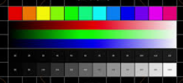
The following are a list of issues I have with color that I think are relevant to the issue I am having. Not solutions, but observations. And I know it will come up, so I need to state up front that I have not used a monitor calibrator to calibrate my monitor. And I know that will get me in all sorts of trouble in this forum. Do not hold back, but I did do a calibration by other means, and I have my reasons for not using a calibrator.
The list:
1. The colors I see on my monitor matches fully my expectations of what these objects should look like. Not just my images, but of the thousands of images I have seen here on AB and other sites.
2. The colors I see of terrestrial subjects on my monitor match perfectly my expectations. That includes my images of people, landscapes etc. Also images of places I have been but taken by others.
3. The colors I see on other monitors, including multiple phone images match very well those I see on my monitor. That includes AB images of mine and others' astroimages.
4. My ability to see rather subtle color shifts is probably not so bad
5. For my monitor, my workspace includes two windows and a couple of incandescent-mimicing LED lights. These are on the typical "warm" end of the lighting spectrum. The difference between working on images at my computer with this lighting at night, lights on vs off is not that great regarding color shift. After all, the monitor is generating most of its own light. However, on a sunny day, the monitor is certainly affected. Overall, it appears to not be a huge effect.
6. For prints, I have found that the ambient light that is used to view prints has a profound effect! So much so that I can come to almost two different conclusions about the relatedness of the print to what I see on the monitor depending on ambient room lighting vs. natural light coming through the windows on a sunny day.
7. The previous prints I have made that seem to work best are of those that have the largest percentage of the frame with brighter components. Those seem to better match the ratio of bright vs. dark that are typical of terrestrial images and portraits. Some of my darker images are disappointing, re their relatedness to that which I can see on my monitor, but it is those that, when placed near a bright window or near sunlight look best. Even for very dark images.
So there it is! I think items 1-5 speak towards my not using a monitor calibrator. Bottom line is even though less affected, my monitor perception is still different depending on my office lighting. So even if I tried to do so, would I have to calibrate my office lighting first?! And I don't like working in a cave!
Related to office lighting but addressing issue with placement of prints; Need I first select museum-grade lighting to illuminate my prints prior to dropping the $100+ for a print? Does anyone know of a printer outlet that has a calibration capability to come to the proper settings to get the desired outcome? Is the issue just that prints, can never match the typical full dynamic range that we achieve on our computers? Are there any tricks to overcome whatever the problem is? Have other struggled with this? Are we doomed to only view our images on computer monitors?
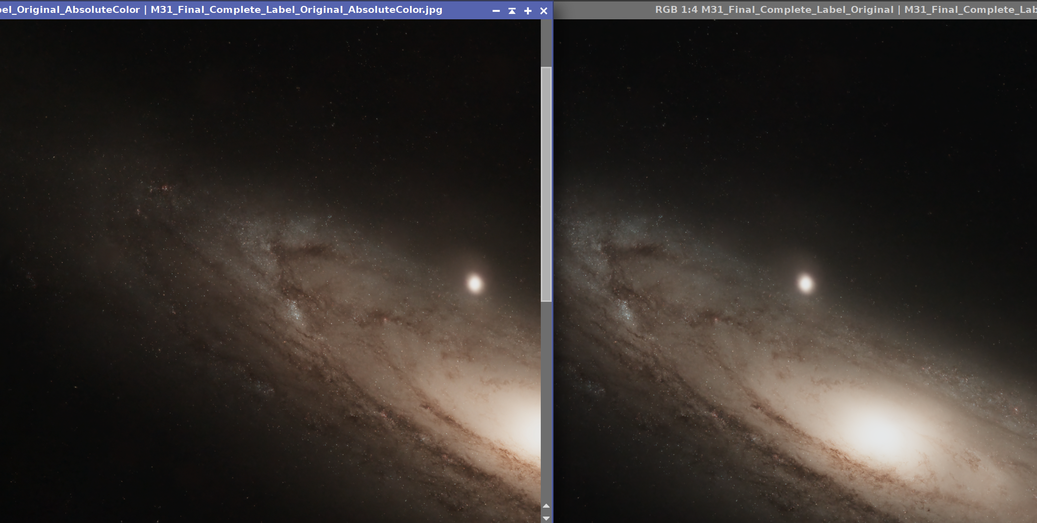
To help with this discussion, I provide you with the image I tried to print:

The Intergalactic Traveler's view of M31, The Andromeda Galaxy
Yes, this is not the most dynamic image. Neither in dynamic range or in color saturation. (First this was SPCC'd when the stars were present. It is starless, but I can tell you that the red stars looked red and the blue stars looked blue. This was stretched without much in the way of contrast enhancement. It was also processed without any color saturation.) I had considered doing this in B&W, but I do like the subtle colors. The intent here is not to make this a dramatic image via added H alpha or saturated bright blues so typically done. But rather I want a natural, color calibrated and non-saturation enhanced print. I am no longer in any rush. Having done this with my 61mm doublet, I have decided that I want to recapture data with a larger aperature scope and also go a lot deeper for the background galaxies. Then generate a similar composition.