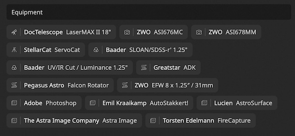
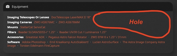
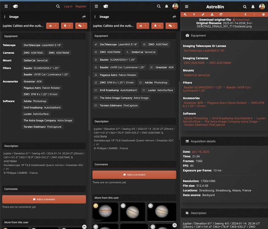
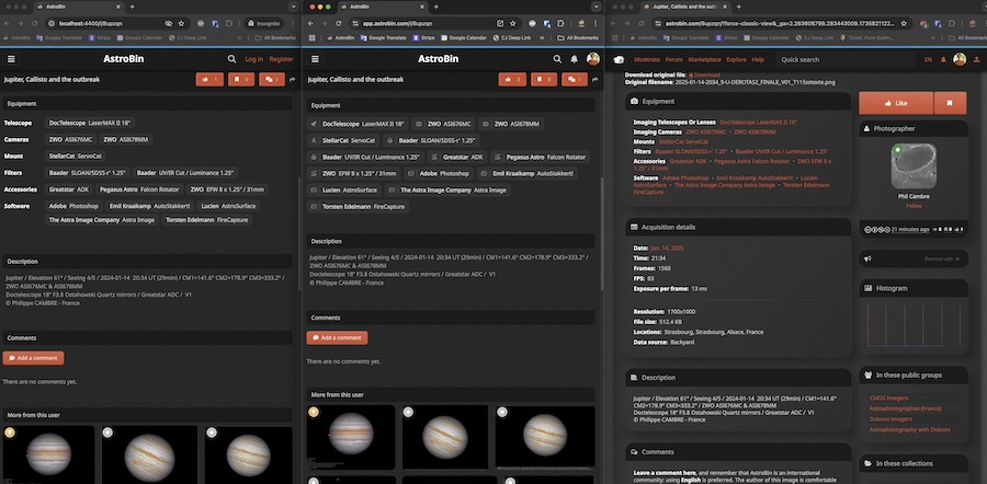
Hi all! @Daniele and some other people in the past have made a point that the equipment section in the new UI is less legible than it used to be, because there are no category labels, but just icons:  The decision to display them like this was driven by the desire to make the design more compact and less wasteful of space. For instance, the same equipment in the classic view looks like this: 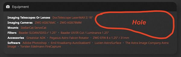 In this particular example, tho, there are holes in both views and the new UI is not less tall! It is less tall more frequently tho, especially when there's fewer items per category and the names are shorter on average. However, not having the "Telescopes" / "Cameras" / "Mounts" / etc labels does worsen the legibility in my opinion too. So I tried something like this. Left: new experimental version Center: current "new UI" version Right: classic view  And here's a desktop view:  What do you guys think? Should I bring back the category labels? You can try a live version here: https://beta-app.astrobin.com/searchPlease let me know what you think, and thank you! Salvatore
|
You cannot like this item. Reason: "ANONYMOUS".
You cannot remove your like from this item.
Editing a post is only allowed within 24 hours after creating it.
You cannot Like this post because the topic is closed.
Copy the URL below to share a direct link to this post.
This post cannot be edited using the classic forums editor.
To edit this post, please enable the "New forums experience" in your settings.
Bring back categories, left one is most readable for me. Don't mind that empty space
|
You cannot like this item. Reason: "ANONYMOUS".
You cannot remove your like from this item.
Editing a post is only allowed within 24 hours after creating it.
You cannot Like this post because the topic is closed.
Copy the URL below to share a direct link to this post.
This post cannot be edited using the classic forums editor.
To edit this post, please enable the "New forums experience" in your settings.
Robert Žibreg:
Bring back categories, left one is most readable for me. Don't mind that empty space Agreed
|
You cannot like this item. Reason: "ANONYMOUS".
You cannot remove your like from this item.
Editing a post is only allowed within 24 hours after creating it.
You cannot Like this post because the topic is closed.
Copy the URL below to share a direct link to this post.
This post cannot be edited using the classic forums editor.
To edit this post, please enable the "New forums experience" in your settings.
andrea tasselli:
Robert Žibreg:
Bring back categories, left one is most readable for me. Don't mind that empty space
Agreed +1
|
You cannot like this item. Reason: "ANONYMOUS".
You cannot remove your like from this item.
Editing a post is only allowed within 24 hours after creating it.
You cannot Like this post because the topic is closed.
Copy the URL below to share a direct link to this post.
This post cannot be edited using the classic forums editor.
To edit this post, please enable the "New forums experience" in your settings.
Salvatore, the new experimental version on the left side looks appealing to me too. Thank you!
Agreed +3
|
You cannot like this item. Reason: "ANONYMOUS".
You cannot remove your like from this item.
Editing a post is only allowed within 24 hours after creating it.
You cannot Like this post because the topic is closed.
Copy the URL below to share a direct link to this post.
This post cannot be edited using the classic forums editor.
To edit this post, please enable the "New forums experience" in your settings.
IMHO, left and right layouts are clear and quickly readable while the middle one (icons) brings mess. Sorry for that, I appreciate your effort.
Does the empty space cost anything? Money? Space on the server storage? AFAIK, it doesn't. The 'compact' version seems pointless if someone writes essays about their images and/or have tons of positive comments.
|
You cannot like this item. Reason: "ANONYMOUS".
You cannot remove your like from this item.
Editing a post is only allowed within 24 hours after creating it.
You cannot Like this post because the topic is closed.
Copy the URL below to share a direct link to this post.
This post cannot be edited using the classic forums editor.
To edit this post, please enable the "New forums experience" in your settings.
Does the empty space cost anything? Money? Yeah I have a special agreement with Amazon Web Services, I pay by the pixel used :-D
|
You cannot like this item. Reason: "ANONYMOUS".
You cannot remove your like from this item.
Editing a post is only allowed within 24 hours after creating it.
You cannot Like this post because the topic is closed.
Copy the URL below to share a direct link to this post.
This post cannot be edited using the classic forums editor.
To edit this post, please enable the "New forums experience" in your settings.
Yes, bring back categories. I think some empty space just makes it more easy to read.
|
You cannot like this item. Reason: "ANONYMOUS".
You cannot remove your like from this item.
Editing a post is only allowed within 24 hours after creating it.
You cannot Like this post because the topic is closed.
Copy the URL below to share a direct link to this post.
This post cannot be edited using the classic forums editor.
To edit this post, please enable the "New forums experience" in your settings.
Thanks everyone for the feedback, due the popular demand I will bring back the category labels (tho I might need to increase @Vroobel's subscription price to afford the new empty pixels! 🤣)
|
You cannot like this item. Reason: "ANONYMOUS".
You cannot remove your like from this item.
Editing a post is only allowed within 24 hours after creating it.
You cannot Like this post because the topic is closed.
Copy the URL below to share a direct link to this post.
This post cannot be edited using the classic forums editor.
To edit this post, please enable the "New forums experience" in your settings.
It's live! Enjoy and thanks 🙏
|
You cannot like this item. Reason: "ANONYMOUS".
You cannot remove your like from this item.
Editing a post is only allowed within 24 hours after creating it.
You cannot Like this post because the topic is closed.
Copy the URL below to share a direct link to this post.
This post cannot be edited using the classic forums editor.
To edit this post, please enable the "New forums experience" in your settings.
I prefer the right, then the left. I don't like the one in the middle, sorry. For me, readability and clarity are the most important factors, some empty space just improves this.
|
You cannot like this item. Reason: "ANONYMOUS".
You cannot remove your like from this item.
Editing a post is only allowed within 24 hours after creating it.
You cannot Like this post because the topic is closed.
Copy the URL below to share a direct link to this post.
This post cannot be edited using the classic forums editor.
To edit this post, please enable the "New forums experience" in your settings.
Left one has been deployed already, @Esa Viitala. Kiitti palautteesta!
|
You cannot like this item. Reason: "ANONYMOUS".
You cannot remove your like from this item.
Editing a post is only allowed within 24 hours after creating it.
You cannot Like this post because the topic is closed.
Copy the URL below to share a direct link to this post.
This post cannot be edited using the classic forums editor.
To edit this post, please enable the "New forums experience" in your settings.
Now it's more clear and better.
Why not adopt the same labels for the guiding equipment to keep it more coherent? Of course if it's not a problem.
|
You cannot like this item. Reason: "ANONYMOUS".
You cannot remove your like from this item.
Editing a post is only allowed within 24 hours after creating it.
You cannot Like this post because the topic is closed.
Copy the URL below to share a direct link to this post.
This post cannot be edited using the classic forums editor.
To edit this post, please enable the "New forums experience" in your settings.
Daniele Borsari:
Now it's more clear and better.
Why not adopt the same labels for the guiding equipment to keep it more coherent? Of course if it's not a problem. Because there’s usually only one telescope and one camera there, so it’s easy to read already, and it’s not a vital piece of information, so for that I thought it’s a good idea to save on vertical space and avoid even more scrolling to go down to the comments.
|
You cannot like this item. Reason: "ANONYMOUS".
You cannot remove your like from this item.
Editing a post is only allowed within 24 hours after creating it.
You cannot Like this post because the topic is closed.
Copy the URL below to share a direct link to this post.
This post cannot be edited using the classic forums editor.
To edit this post, please enable the "New forums experience" in your settings.
Salvatore Iovene:
Thanks everyone for the feedback, due the popular demand I will bring back the category labels (tho I might need to increase @Vroobel's subscription price to afford the new empty pixels! 🤣) I pay the highest subscription anyway. 😁
|
You cannot like this item. Reason: "ANONYMOUS".
You cannot remove your like from this item.
Editing a post is only allowed within 24 hours after creating it.
You cannot Like this post because the topic is closed.
Copy the URL below to share a direct link to this post.
This post cannot be edited using the classic forums editor.
To edit this post, please enable the "New forums experience" in your settings.
Please bring back the original category labels. The new scheme is definitely less legible than the original.
|
You cannot like this item. Reason: "ANONYMOUS".
You cannot remove your like from this item.
Editing a post is only allowed within 24 hours after creating it.
You cannot Like this post because the topic is closed.
Copy the URL below to share a direct link to this post.
This post cannot be edited using the classic forums editor.
To edit this post, please enable the "New forums experience" in your settings.
Dean Jacobsen:
Please bring back the original category labels. The new scheme is definitely less legible than the original. It's already done! The new scheme is already the old scheme by now  |
You cannot like this item. Reason: "ANONYMOUS".
You cannot remove your like from this item.
Editing a post is only allowed within 24 hours after creating it.
You cannot Like this post because the topic is closed.
Copy the URL below to share a direct link to this post.
This post cannot be edited using the classic forums editor.
To edit this post, please enable the "New forums experience" in your settings.
Good one, thank you Salvatore  |
You cannot like this item. Reason: "ANONYMOUS".
You cannot remove your like from this item.
Editing a post is only allowed within 24 hours after creating it.
You cannot Like this post because the topic is closed.
Copy the URL below to share a direct link to this post.
This post cannot be edited using the classic forums editor.
To edit this post, please enable the "New forums experience" in your settings.