What's up with the new search engine? Seems to be less direct in finding targets. I don't like it at all. Please return back to the previous search engine.
|
You cannot like this item. Reason: "ANONYMOUS".
You cannot remove your like from this item.
Editing a post is only allowed within 24 hours after creating it.
You cannot Like this post because the topic is closed.
Copy the URL below to share a direct link to this post.
This post cannot be edited using the classic forums editor.
To edit this post, please enable the "New forums experience" in your settings.
Hi Douglas, What do you mean "less direct"? You can switch to the old page in your preferences: https://www.astrobin.com/profile/edit/preferences/(see bottom the of the form) Please let me know which search parameters lead to worse search results as before. For your information, all the changes are purely visual, save for one thing that changed in the default behavior: Now, when you search for multiple words, AstroBin looks for images that match BOTH words, while before it looked for images that matched ANY words. I'm talking about "free text" kind of searches. Please, do let me know which specific use cases might have slipped my attention so I can fix it if needed. Thanks, Salvatore
|
You cannot like this item. Reason: "ANONYMOUS".
You cannot remove your like from this item.
Editing a post is only allowed within 24 hours after creating it.
You cannot Like this post because the topic is closed.
Copy the URL below to share a direct link to this post.
This post cannot be edited using the classic forums editor.
To edit this post, please enable the "New forums experience" in your settings.
Salvatore,
thanks for the clarification that we have the option to use the old or new.
Just one question: there are three options, yes, no, and unknown, What does "unknown" mean?
Cheers, Göran
|
You cannot like this item. Reason: "ANONYMOUS".
You cannot remove your like from this item.
Editing a post is only allowed within 24 hours after creating it.
You cannot Like this post because the topic is closed.
Copy the URL below to share a direct link to this post.
This post cannot be edited using the classic forums editor.
To edit this post, please enable the "New forums experience" in your settings.
Hi Göran, "Unknown" is the same as "No". Please note that I don't make promises as to how long the old page will be around. For the next year, I don't have a reason to remove it, surely. After that, it depends Surely tho, it won't receive updates of improvements, as things need to move forward. Also, I cannot think of a single way in which the old page is better than the new one, except the "I'm used to it argument", which you can solve easily by using the new page a few times  If you have specific example of things that are easier to do in the old page, of features that are missing in the new page, please let me know and I can either fix it or tell you how it works better with the new page. Thanks!
|
You cannot like this item. Reason: "ANONYMOUS".
You cannot remove your like from this item.
Editing a post is only allowed within 24 hours after creating it.
You cannot Like this post because the topic is closed.
Copy the URL below to share a direct link to this post.
This post cannot be edited using the classic forums editor.
To edit this post, please enable the "New forums experience" in your settings.
What I liked with the old system was that I got directly to the image post when I clicked on a thumbnail. Is there a way to do this in the new system? Or do I have to click on the photographer and then find the image on his page. Also I cannot find the "your images" filter in the new system.
|
You cannot like this item. Reason: "ANONYMOUS".
You cannot remove your like from this item.
Editing a post is only allowed within 24 hours after creating it.
You cannot Like this post because the topic is closed.
Copy the URL below to share a direct link to this post.
This post cannot be edited using the classic forums editor.
To edit this post, please enable the "New forums experience" in your settings.
Hi Göran, Göran Nilsson:
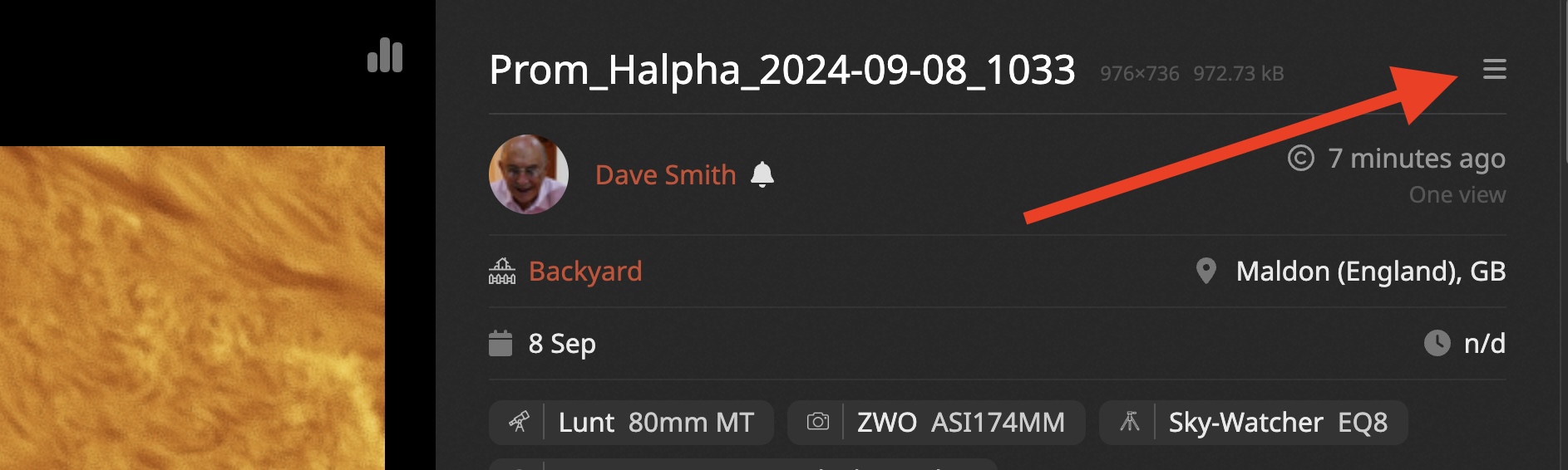
What I liked with the old system was that I got directly to the image post when I clicked on a thumbnail. I assume this is feedback for the new image viewer that you access from the new search page. What kind of information are you missing (or you find hard to read or to find) in the new viewer? The information should be complete there, and better organized. Additionally, the page should work better on large desktops and mobile phones, and you should be able to do anything you can with the classic view. And the image zoom is better! The only thing missing is the "plate-solving settings" menu entries for your own images. Please let me know what you find missing or lacking so I can either tell you how to do it or improve it. To access the classic view, you can click on the menu that's near the image's title:  Göran Nilsson:
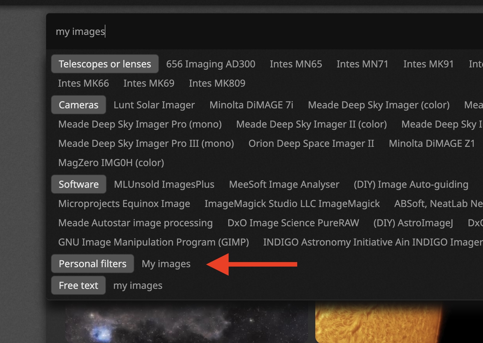
Also I cannot find the "your images" filter in the new system. It's in the filters:  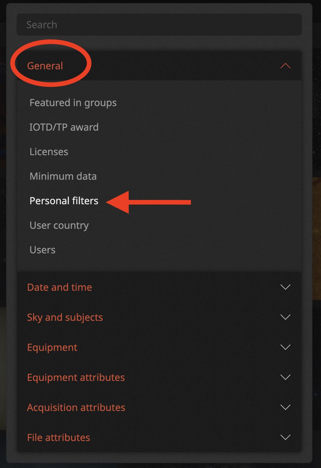 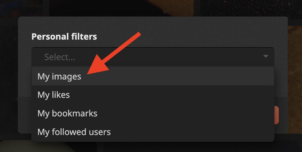 And you can literally type "my images" and hit enter, which will select the filter automatically.  |
You cannot like this item. Reason: "ANONYMOUS".
You cannot remove your like from this item.
Editing a post is only allowed within 24 hours after creating it.
You cannot Like this post because the topic is closed.
Copy the URL below to share a direct link to this post.
This post cannot be edited using the classic forums editor.
To edit this post, please enable the "New forums experience" in your settings.
The more I use it, the more I like it…
|
You cannot like this item. Reason: "ANONYMOUS".
You cannot remove your like from this item.
Editing a post is only allowed within 24 hours after creating it.
You cannot Like this post because the topic is closed.
Copy the URL below to share a direct link to this post.
This post cannot be edited using the classic forums editor.
To edit this post, please enable the "New forums experience" in your settings.
One needs to get used to the new layout and report if I missed something, surely, but functionally I find it vastly superior and I'm very happy about it.
|
You cannot like this item. Reason: "ANONYMOUS".
You cannot remove your like from this item.
Editing a post is only allowed within 24 hours after creating it.
You cannot Like this post because the topic is closed.
Copy the URL below to share a direct link to this post.
This post cannot be edited using the classic forums editor.
To edit this post, please enable the "New forums experience" in your settings.
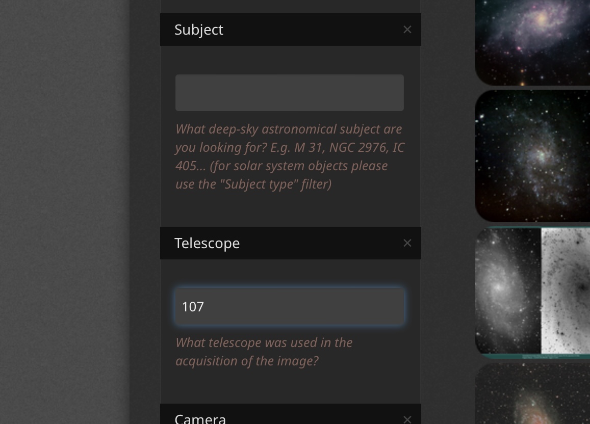
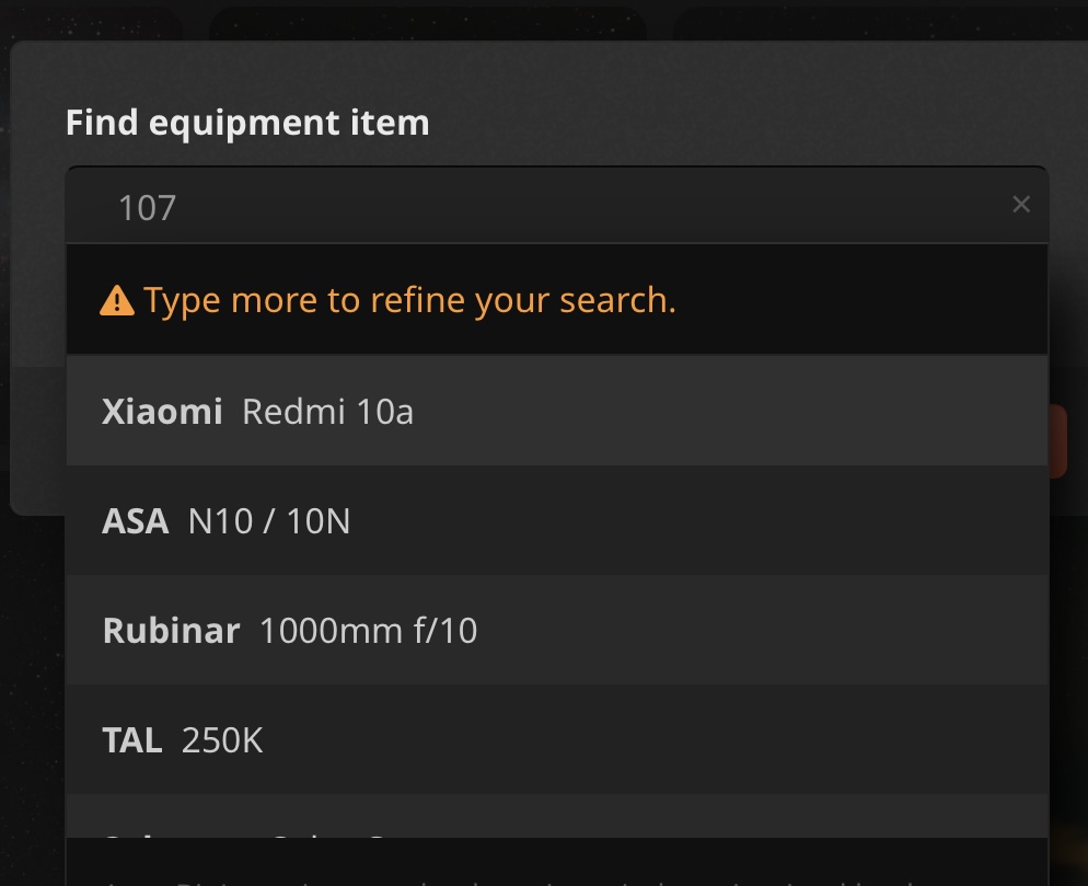
I'm also not so happy with the new search page, maybe just because it's still new to me :-). I'll just give one example where the old one was better (for my own use): when specifying a telescope I could type in 107 which covered both the Askar and ZWO 107 aperture scopes, giving the expected results, the new search page gives me an error.
|
You cannot like this item. Reason: "ANONYMOUS".
You cannot remove your like from this item.
Editing a post is only allowed within 24 hours after creating it.
You cannot Like this post because the topic is closed.
Copy the URL below to share a direct link to this post.
This post cannot be edited using the classic forums editor.
To edit this post, please enable the "New forums experience" in your settings.
Hi Esa, what error? If I just search for "107" I do get results. What is you exact search? Thanks! 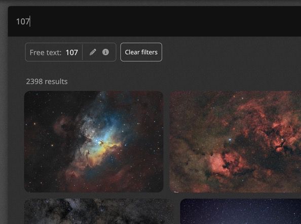 |
You cannot like this item. Reason: "ANONYMOUS".
You cannot remove your like from this item.
Editing a post is only allowed within 24 hours after creating it.
You cannot Like this post because the topic is closed.
Copy the URL below to share a direct link to this post.
This post cannot be edited using the classic forums editor.
To edit this post, please enable the "New forums experience" in your settings.
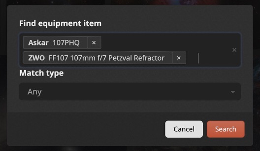
PS, why would you just search for 107? That kind of free text search will give you all sort of results, including images with stars that have 107 in their catalog name, or people typing "this is my 107th attempt" and other random stuff. Now you can search for exact matches: Search for the Askar or the ZwoYou could not do this before.  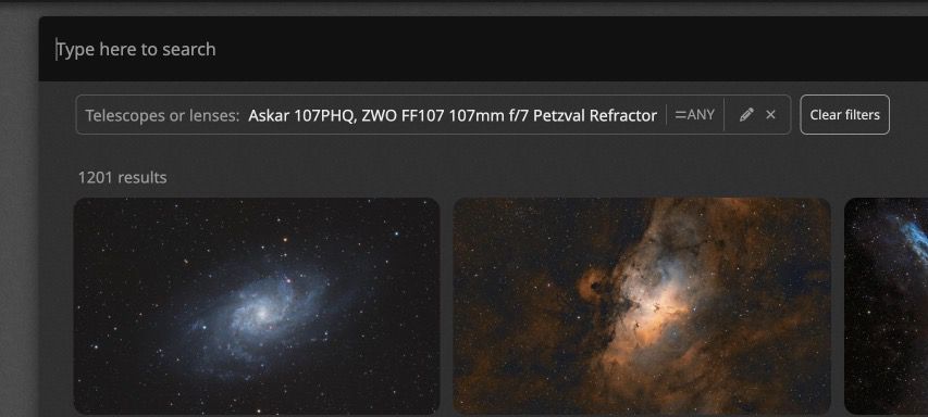 |
You cannot like this item. Reason: "ANONYMOUS".
You cannot remove your like from this item.
Editing a post is only allowed within 24 hours after creating it.
You cannot Like this post because the topic is closed.
Copy the URL below to share a direct link to this post.
This post cannot be edited using the classic forums editor.
To edit this post, please enable the "New forums experience" in your settings.
Sure, you are of course right about the query and result being an overkill. But more oftnn than not it (and similar queries) has given me the results I’ve been looking for. IMG_4742.jpegIMG_4741.jpeg |
You cannot like this item. Reason: "ANONYMOUS".
You cannot remove your like from this item.
Editing a post is only allowed within 24 hours after creating it.
You cannot Like this post because the topic is closed.
Copy the URL below to share a direct link to this post.
This post cannot be edited using the classic forums editor.
To edit this post, please enable the "New forums experience" in your settings.
I think you can "type more to refine your search" as suggested, which will give you the correct results 100% of the times, instead of most of the times |
You cannot like this item. Reason: "ANONYMOUS".
You cannot remove your like from this item.
Editing a post is only allowed within 24 hours after creating it.
You cannot Like this post because the topic is closed.
Copy the URL below to share a direct link to this post.
This post cannot be edited using the classic forums editor.
To edit this post, please enable the "New forums experience" in your settings.
I guess I'm an opportunist and will do the least to get the results I want the fastest. But never mind, eventually I'll get used to the new search page too.
|
You cannot like this item. Reason: "ANONYMOUS".
You cannot remove your like from this item.
Editing a post is only allowed within 24 hours after creating it.
You cannot Like this post because the topic is closed.
Copy the URL below to share a direct link to this post.
This post cannot be edited using the classic forums editor.
To edit this post, please enable the "New forums experience" in your settings.
PS: if there's a search you do often, you can save it now (or, as before, bookmark it in your browser).  |
You cannot like this item. Reason: "ANONYMOUS".
You cannot remove your like from this item.
Editing a post is only allowed within 24 hours after creating it.
You cannot Like this post because the topic is closed.
Copy the URL below to share a direct link to this post.
This post cannot be edited using the classic forums editor.
To edit this post, please enable the "New forums experience" in your settings.
I tried to use the new search engine for a little bit but I had to go back to the old version (thanks for making that choice available).
My main issue is with the layout. There isn't enough white space. Everything is mashed together and actually made it difficult to focus on what I wanted to look at. A good analogy would a long forum post that's just one solid wall of text verse adding a couple of paragraphs. Much easier to read something that is broken up in paragraphs instead of a giant wall of text.
The new search in its current form feels like a giant wall of text.
|
You cannot like this item. Reason: "ANONYMOUS".
You cannot remove your like from this item.
Editing a post is only allowed within 24 hours after creating it.
You cannot Like this post because the topic is closed.
Copy the URL below to share a direct link to this post.
This post cannot be edited using the classic forums editor.
To edit this post, please enable the "New forums experience" in your settings.
Hi James, thanks for the feedback, I can see where you're coming from! I assume you're talking about the image viewer, rather than the actual search result, as they're just a bunch of thumbnails not unlike before. Would something like the following work better for you? Open this in a tab: https://beta-app.astrobin.com/searchAnd compare images with this: https://app.astrobin.com/searchThere's a bit more spacing and some headers in the data that I think make the eyes track the information better. Looking forward to your feedback! Salvatore 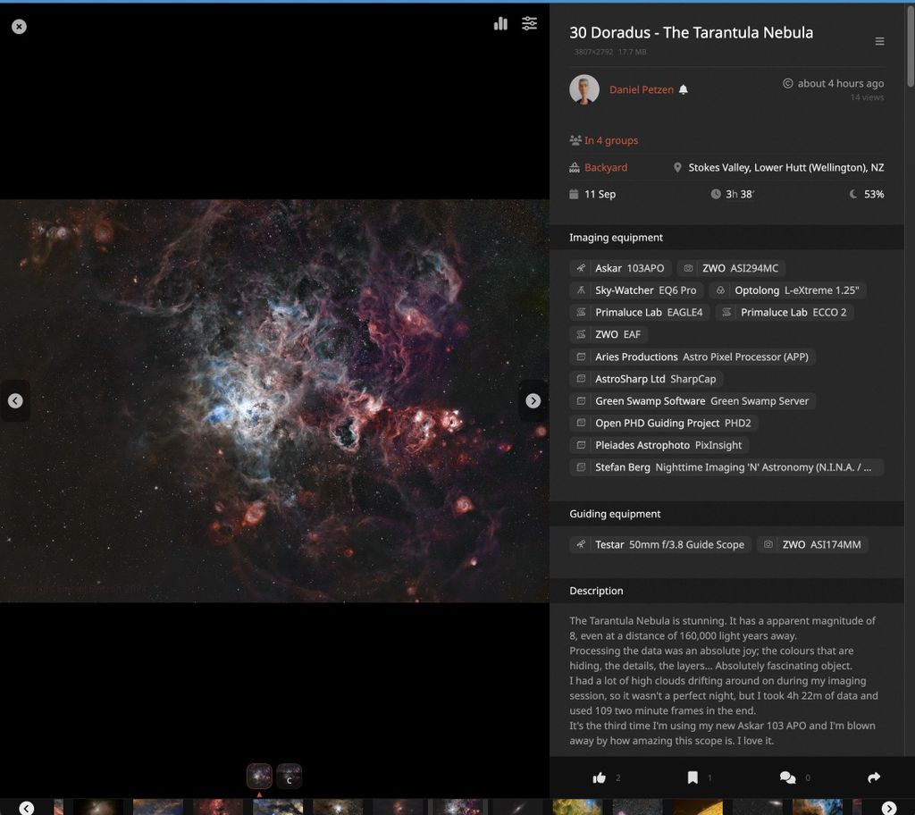 |
You cannot like this item. Reason: "ANONYMOUS".
You cannot remove your like from this item.
Editing a post is only allowed within 24 hours after creating it.
You cannot Like this post because the topic is closed.
Copy the URL below to share a direct link to this post.
This post cannot be edited using the classic forums editor.
To edit this post, please enable the "New forums experience" in your settings.
After looking at the updated version with the headers and more spacing, I have to wholeheartedly agree with @James, so I went ahead and deployed this change. If anybody has any other feedback related to this, please don't hesitate to let me know, as I do listen (as you know). Another change that is about to be deployed as I type this concerns the search bar. Thanks to feedback from a user, and seeing that many people do prefer the simplicity of a simple text search even tho the results are less accurate, I decided that the dropdown autocomplete was a bit too aggressive, so it does not open by default anymore (change pending deployment):  After testing this for a while I very much prefer it and it becomes second nature quite quickly, at least for me. Hope this helps!
|
You cannot like this item. Reason: "ANONYMOUS".
You cannot remove your like from this item.
Editing a post is only allowed within 24 hours after creating it.
You cannot Like this post because the topic is closed.
Copy the URL below to share a direct link to this post.
This post cannot be edited using the classic forums editor.
To edit this post, please enable the "New forums experience" in your settings.
Salvatore Iovene:
There's a bit more spacing and some headers in the data that I think make the eyes track the information better. Yes, much easier on the eyes. Thank you!
|
You cannot like this item. Reason: "ANONYMOUS".
You cannot remove your like from this item.
Editing a post is only allowed within 24 hours after creating it.
You cannot Like this post because the topic is closed.
Copy the URL below to share a direct link to this post.
This post cannot be edited using the classic forums editor.
To edit this post, please enable the "New forums experience" in your settings.
I have one more improvement coming up in the next hour!
|
You cannot like this item. Reason: "ANONYMOUS".
You cannot remove your like from this item.
Editing a post is only allowed within 24 hours after creating it.
You cannot Like this post because the topic is closed.
Copy the URL below to share a direct link to this post.
This post cannot be edited using the classic forums editor.
To edit this post, please enable the "New forums experience" in your settings.
My goodness I thought I was the only one. At first I though it was only a change to the UI on my phone but using my desktop and I used to enjoy searching by telescope, clicking on the image and going straight to the users page with the image. This new image viewer is an inconvenience. Clicked on some pictures and user experience feel like a step backwards from what was available before.
I even had to check my subscription to make sure I had paid the renewal and I had.
Would I be able to elect the previous interface.
The UX before was dead easy and I think it's been overcomplicated. I loved the search parameters on the left where you could search by telescope, camera (if you wanted), and sort by publication all in one place. This feels clunky and it pains me to say that when a lot of work would have gone into the changes but not sure what the driver for the changes were. I certainly spend less time interfacing and the proof will be in the pudding if users receive less views and/or recognition for their efforts. Sometimes I would spend time just looking and liking peoples work, but that's eroding now!
Edit: I changed preferences and have a smile on my face |
You cannot like this item. Reason: "ANONYMOUS".
You cannot remove your like from this item.
Editing a post is only allowed within 24 hours after creating it.
You cannot Like this post because the topic is closed.
Copy the URL below to share a direct link to this post.
This post cannot be edited using the classic forums editor.
To edit this post, please enable the "New forums experience" in your settings.
I'd love to know which interactions are worse, exactly. To me (I'm biased, of course) basically everything works and looks better with the new interface, both for the search page and for the image viewer. Can you mention some things that you can do easier with the old interface? I can probably either fix that edge case, or tell you what you're missing if you don't find it easier to do with the new interface. I understand that change is not for everyone tho, so you can revert to the old page in your preferences. And no, the UX was NOT dead easy before: it's just that you were used to it. For instance, to add a filter, you had to scroll all the way down, find the filter in a long list, then AstroBin would add a box in the middle of the sidebar and you had to find it, and then input your search parameters in that box. Yikes! Now if you know the filter you want to add, you start typing it, e.g. "integration", "iotd", "telescope", hit TAB and click on the suggestion. Or click on the Filters icon where you can find it grouped by categories. And of course, now you can easily see the images in the search result just by clicking on the Next button. With the old interface, you need to open them in new tabs. How's that for clumsy? When it comes to the image viewer, again, it's just what you're used to vs what's new. I guarantee you that if things were reverted (e.g. the new one was the classic view, and I switched to the old one as the new) you'd not be happy! Now the image is bigger, the zoom is better, the data is more readily available (e.g. you don't need to scroll down below the fold to see the equipment!) and the integration details per filters aren't a huge mess when there's a lot of filters and/or a lot of dates. The page doesn't have information strewn all over the place but they have more logical grouping (e.g. the image resolution is not in the acquisition sessions like before, etc). Again, you can switch back in your settings but I recommend you give it some time to get used to it! And if you have some specific edge cases that I overlooked, please tell me what they are Thanks!
|
You cannot like this item. Reason: "ANONYMOUS".
You cannot remove your like from this item.
Editing a post is only allowed within 24 hours after creating it.
You cannot Like this post because the topic is closed.
Copy the URL below to share a direct link to this post.
This post cannot be edited using the classic forums editor.
To edit this post, please enable the "New forums experience" in your settings.
Is there a way to leave this thread I created so I stop getting notifications via email? I don't see anything. The new search engine is what it is.
|
You cannot like this item. Reason: "ANONYMOUS".
You cannot remove your like from this item.
Editing a post is only allowed within 24 hours after creating it.
You cannot Like this post because the topic is closed.
Copy the URL below to share a direct link to this post.
This post cannot be edited using the classic forums editor.
To edit this post, please enable the "New forums experience" in your settings.
Hi Salvatore
Thank you so much for your speedy and helpful response.
Given your approach and openness to suggestions, it is only right that I take you up on the offer, use the latest changes for a week or two and then see if I am missing anything.
Maybe it is just that I am used to the other version. I mainly liked the way information was arranged in the older version from searches and readily searching by telescope, object, camera and by publication date. I know those parameters are still there but are hidden from plain view. I might search on my computer, walk away and get other things done during the day, come back to my screen and readily see what I had search and resume my thought pattern.
On the previous version clicking on an image, all the information pertaining to the image was arranged in logical order on the image page ranging from the telescope, mount, accessories etc below that the amount of time spent on acquisition and on each filter. In the new version I can see the new image viewer (on the left) and image details on the right though my first thought is it looks like information overload not particularly in logical order. For example I have to click on the total integration time to reveal the filter breakdown which is an extra step in the process. If, for example, I searched for something like a specific telescope used with a specific mount and a specific camera, if I had left the desktop for a while and came back to it I would have to open the filter to see what my parameters when previously a glance to my left would have revealed everything I had filtered.
Maybe I'm being lazy. Imagine having gotten used to contactless card payments and mobile tap and go, that your bank said you now have to insert your PIN number into the point of sale after tapping…adding an extra step in the process. Aside the zoom, there must have been a reason why you arranged things the way you did with old UI. I'm sure you'll have data coming through to tell how users are interacting with the new features and whether the intended vision at the inception of Astrobin is closer to being met with the new changes.
I will continue with the new and see how it goes for now.
Much appreciated
Rob
|
You cannot like this item. Reason: "ANONYMOUS".
You cannot remove your like from this item.
Editing a post is only allowed within 24 hours after creating it.
You cannot Like this post because the topic is closed.
Copy the URL below to share a direct link to this post.
This post cannot be edited using the classic forums editor.
To edit this post, please enable the "New forums experience" in your settings.
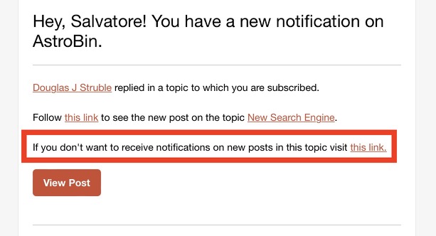
Douglas J Struble:
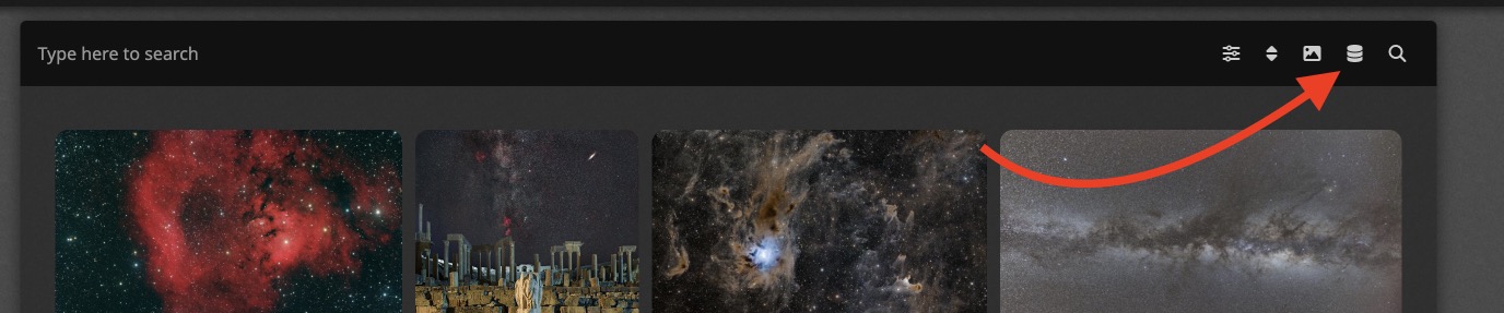
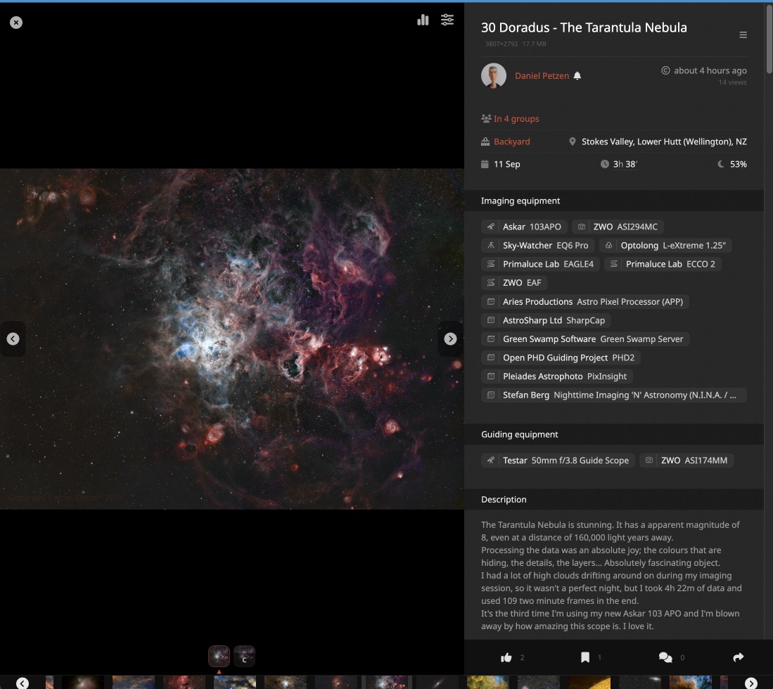
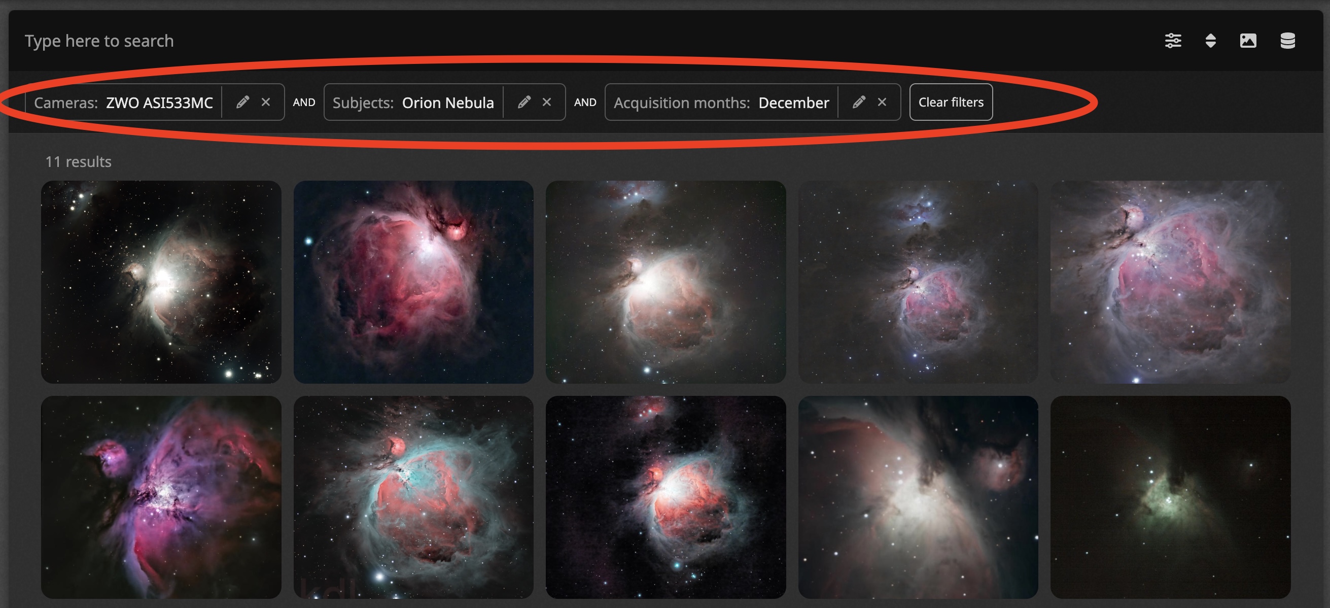
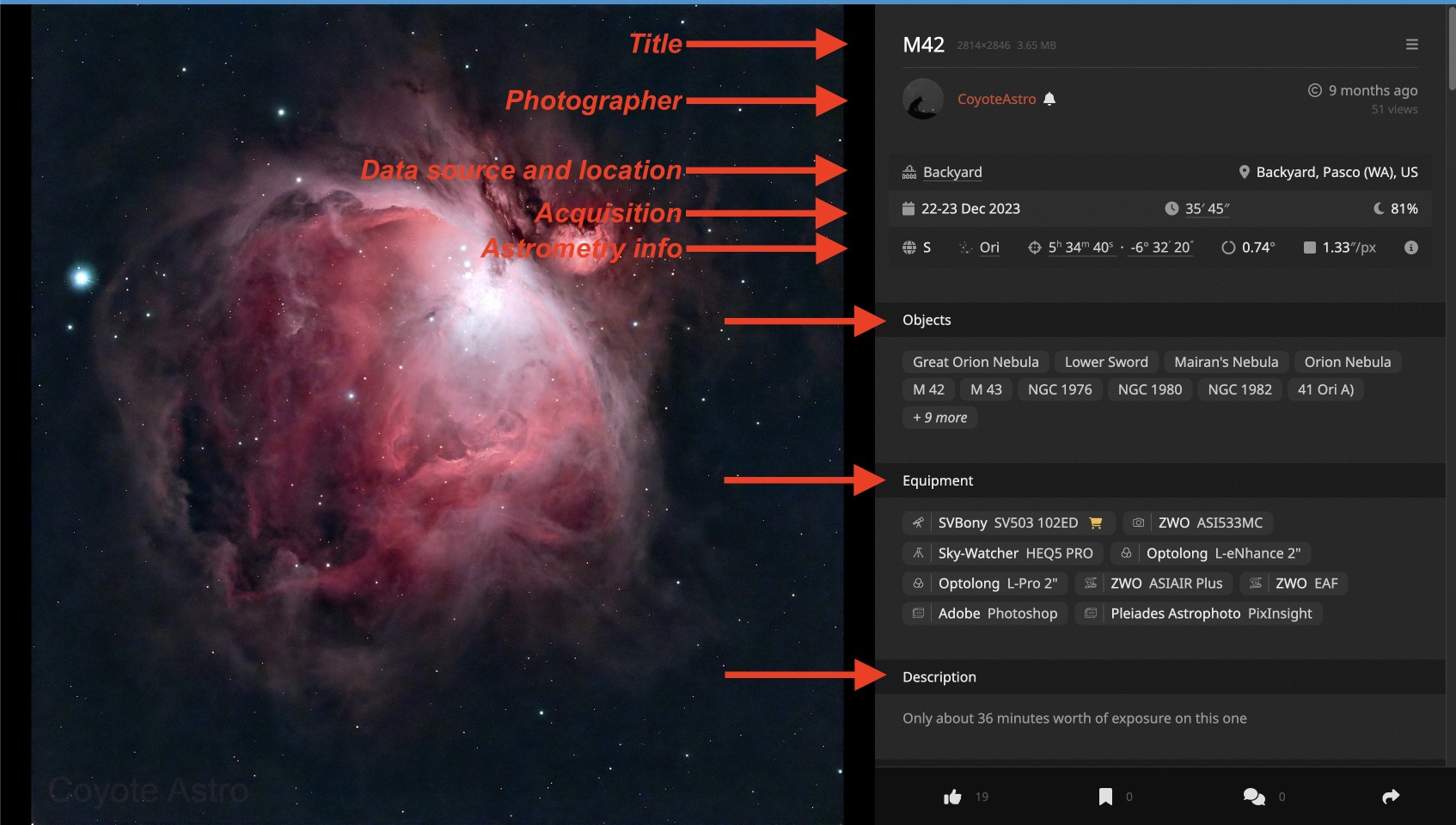
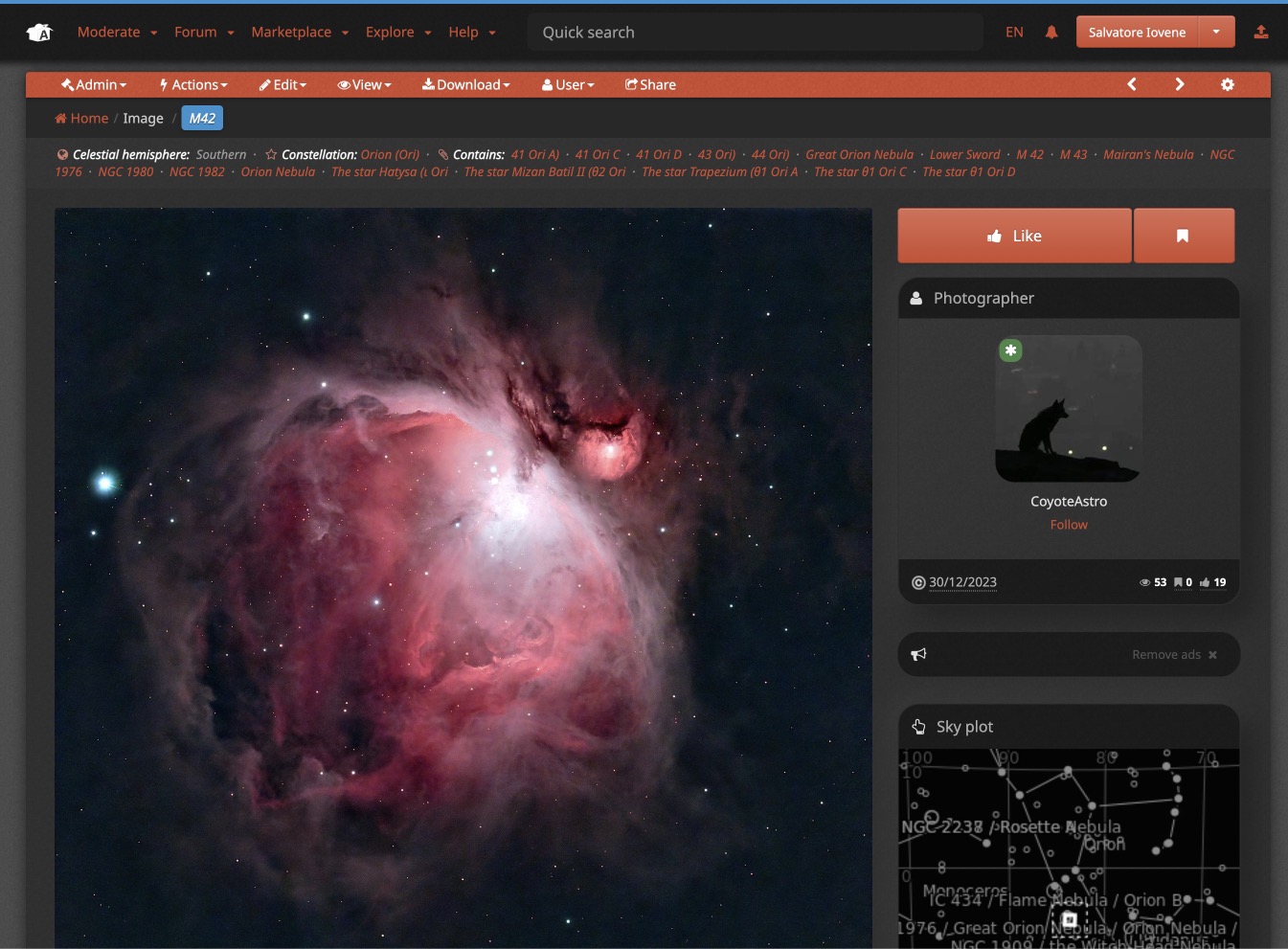
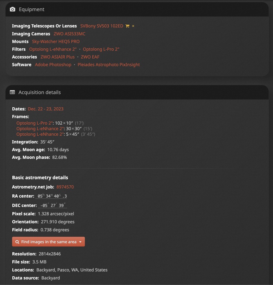
Is there a way to leave this thread I created so I stop getting notifications via email? I don't see anything. The new search engine is what it is. Hi Douglas, the email notifications literally has a link to unsubscribe from the topic:  Or you can click on the "Unsubscribe" button in the orange bar at the top of this page. @AstroRepublic: I might search on my computer, walk away and get other things done during the day, come back to my screen and readily see what I had search and resume my thought pattern. But you can still see your active search filters...! They're right below the search bar: 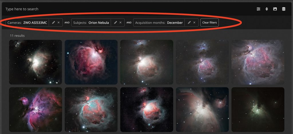 I know those parameters are still there but are hidden from plain view. Just type something and click on the suggestions! This makes for more precise search. The old "Telescope" search was imprecise because it was text based. The new one only finds EXACT matches because it gets images that feature a certain telescope by database id.  On the previous version clicking on an image, all the information pertaining to the image was arranged in logical order on the image page ranging from the telescope, mount, accessories etc below that the amount of time spent on acquisition and on each filter. And so they are now? 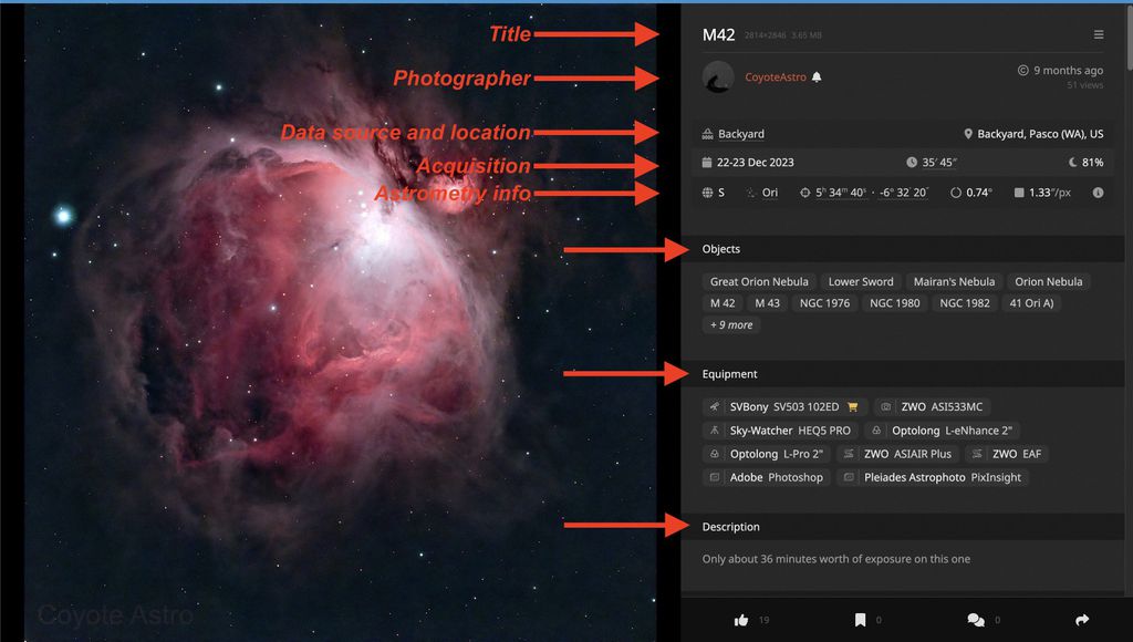 Now let's look at the same image in classic view on the same monitor:  The majority of the information is not even visible if you don't scroll down! The majority of the information is not even visible if you don't scroll down!
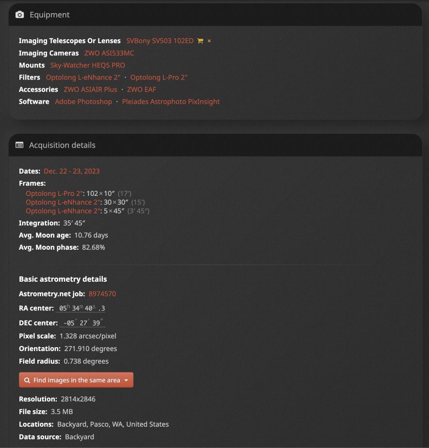 N Now you've scrolled down. Half the page is literally empty space. The equipment is well presented, but then the acquisition detail is a mix of actual acquisition details, then astrometry information (including irrelevant stuff like the Astrometry.net job ID), file size information, and data source / location. This quite messier, arguably. For example I have to click on the total integration time to reveal the filter breakdown which is an extra step in the process. And previously you had to scroll down. You cannot have all the information on the page at all times, otherwise it becomes messy. You can see the most important information first (number of hours) and you can click to see additional information. Seems pretty standard procedure. If, for example, I searched for something like a specific telescope used with a specific mount and a specific camera, if I had left the desktop for a while and came back to it I would have to open the filter to see what my parameters when previously a glance to my left would have revealed everything I had filtered. No, your active filters are persisted just below the search bar (like before they were persisted in the search sidebar. And an important usability improvement now, is that if you click on an image while on a search, it doesn't replace your page, it opens as a full size popup on top of your search: just click ESC or the X button to close it and you are still on the same search page and same scroll position. And you can navigate using the Next button for your ENTIRE search results (it loads new pages automatically as needed. Maybe I'm being lazy. Don't be hard on yourself. In the past 13+ years running this website I have learned that there's a bell curve of how people react to changes. The early adopters (left end of the bell curve) are eager to see new stuff. The vast majority in the middle don't care much and will use things as they come. The right end of curve will usually have a gut reaction and reject all changes even when they are objectively good 🤷♂️ I remember when people literally did petitions and campaigned against... Facebook layout updates! Entire Facebook pages and groups dedicated to protesting layout changes. Now, I'm just a guy with limited means, so when I do layout changes my process is to: - Check the usability with a small number 2-4 of trusted people who provide initial feedback - Roll out the changes to a "beta testers" group on AstroBin with 100-200 members who test it - After I've addressed all feedback, I roll out slowly: 1% or users on the first day, 2% on the second day, etc - Everytime I get feedback I address it Facebook, I'm sure, has a large team of UX and QA specialists who are better than me at this. Despite this, thousands of people will rally against UI changes, because they got used with the old way 🤷♂️ In any case, I don't have a reason not to leave the old UI in place, at least for a long time (years, rather than months), so you are welcome to switch back if you can't get used to the new one. But remember to provide feedback so I can address it!  In this case, it seems a mix of you didn't know you could do the same in the new UI, and you were just used to the old one and had a gut reaction to change, from my point of view. If I missed anything in your feedback, it wasn't on purpose, so do let me know. Thanks! Salvatore
|
You cannot like this item. Reason: "ANONYMOUS".
You cannot remove your like from this item.
Editing a post is only allowed within 24 hours after creating it.
You cannot Like this post because the topic is closed.
Copy the URL below to share a direct link to this post.
This post cannot be edited using the classic forums editor.
To edit this post, please enable the "New forums experience" in your settings.


