Hello, I've been doing astrophotography for about a year, and I need some feedback on what I can do better. In particular, I feel as though stretching broadband images is challenging; however, I welcome general critique to help me become a better astrophotographer. 
M45Equipment and acquisition details: - Telescope: William Optics RedCat 61
- Mount: ZWO AM3
- Guiding Scope: William Optics UniGuide 32mm
- Guiding Camera: ZWO ASI120MM-Mini
- Imaging Camera: ZWO ASI533MC Pro
- Filters: Optolong L-Pro
185x 120s exposures with L-Pro + calibration frames over two nightsProcessed in PixInsightBortle 7 location General PixInsight workflow: - GraXpert
- SPCC
- BlurXterminator
- GHS
- StarXterminator
- Curves on starless image (saturation)
- PixelMath to combine star and starless
- SCNR (green)
- NoiseXterminator
Thanks in advance!
|
You cannot like this item. Reason: "ANONYMOUS".
You cannot remove your like from this item.
Editing a post is only allowed within 24 hours after creating it.
You cannot Like this post because the topic is closed.
Copy the URL below to share a direct link to this post.
This post cannot be edited using the classic forums editor.
To edit this post, please enable the "New forums experience" in your settings.
I like this particular image a lot. The only thing I immediately see is the color balance, which is too much towards the blue.
Try adjusting the blue level a bit.
|
You cannot like this item. Reason: "ANONYMOUS".
You cannot remove your like from this item.
Editing a post is only allowed within 24 hours after creating it.
You cannot Like this post because the topic is closed.
Copy the URL below to share a direct link to this post.
This post cannot be edited using the classic forums editor.
To edit this post, please enable the "New forums experience" in your settings.
Thanks Victor! I just played around with the image and took the blue down a notch per your suggestion and it really is an improvement.
|
You cannot like this item. Reason: "ANONYMOUS".
You cannot remove your like from this item.
Editing a post is only allowed within 24 hours after creating it.
You cannot Like this post because the topic is closed.
Copy the URL below to share a direct link to this post.
This post cannot be edited using the classic forums editor.
To edit this post, please enable the "New forums experience" in your settings.
How do you find the L-Pro does verses your light pollution? I'm under Bortle 8 and am wondering if one of these wide bandpass filters will work well enough to be worth it.
|
You cannot like this item. Reason: "ANONYMOUS".
You cannot remove your like from this item.
Editing a post is only allowed within 24 hours after creating it.
You cannot Like this post because the topic is closed.
Copy the URL below to share a direct link to this post.
This post cannot be edited using the classic forums editor.
To edit this post, please enable the "New forums experience" in your settings.
Tony Gondola:
How do you find the L-Pro does verses your light pollution? I'm under Bortle 8 and am wondering if one of these wide bandpass filters will work well enough to be worth it. That's a good question. I was really debating on if I should use it. I was imaging almost exclusively narrowband over the summer with the L-Ultimate filter, which I really fell in love with, especially when imaging in my Bortle 7 backyard. When I was starting out about a year ago, I was just using an UV/IR Cut filter, but was struggling with the gradients and probably wasn't using the greatest techniques. Now that I'm using tools like GraXpert and I have a year of PixInsight under my belt, those gradients are probably a lot easier to work with. In theory, a light pollution filter would remove some information, so maybe I could have gotten more of the faint nebulosity in this image if I hadn't used it.
|
You cannot like this item. Reason: "ANONYMOUS".
You cannot remove your like from this item.
Editing a post is only allowed within 24 hours after creating it.
You cannot Like this post because the topic is closed.
Copy the URL below to share a direct link to this post.
This post cannot be edited using the classic forums editor.
To edit this post, please enable the "New forums experience" in your settings.
Brion Pellarin:
Tony Gondola:
How do you find the L-Pro does verses your light pollution? I'm under Bortle 8 and am wondering if one of these wide bandpass filters will work well enough to be worth it.
That's a good question. I was really debating on if I should use it. I was imaging almost exclusively narrowband over the summer with the L-Ultimate filter, which I really fell in love with, especially when imaging in my Bortle 7 backyard. When I was starting out about a year ago, I was just using an UV/IR Cut filter, but was struggling with the gradients and probably wasn't using the greatest techniques. Now that I'm using tools like GraXpert and I have a year of PixInsight under my belt, those gradients are probably a lot easier to work with. In theory, a light pollution filter would remove some information, so maybe I could have gotten more of the faint nebulosity in this image if I hadn't used it. Or maybe less since it's mostly broadband reflection from dust. There is an area at the bottom of the frame with a dusting of Ha in it that might make it worthwhile. Maybe some combination of the two would work.
|
You cannot like this item. Reason: "ANONYMOUS".
You cannot remove your like from this item.
Editing a post is only allowed within 24 hours after creating it.
You cannot Like this post because the topic is closed.
Copy the URL below to share a direct link to this post.
This post cannot be edited using the classic forums editor.
To edit this post, please enable the "New forums experience" in your settings.
That is not Ha I believe, but just more red colored reflection on dust. One of the hallmarks of a decent Pleiades image, in my opinion. But that’s just me!
|
You cannot like this item. Reason: "ANONYMOUS".
You cannot remove your like from this item.
Editing a post is only allowed within 24 hours after creating it.
You cannot Like this post because the topic is closed.
Copy the URL below to share a direct link to this post.
This post cannot be edited using the classic forums editor.
To edit this post, please enable the "New forums experience" in your settings.
if I were to offer anything in the way of constructive criticim, it would be
1. It still looks a little blue, and while I know the reflection nebula is blue due to its illuminating stars, I'd say what I mean is, its a very deep, rich blue, where I would expect a more light, airy, almost sky blue.
2. The stars look quite desaturated by comparison to the nebula…
Typically, I find, especially with big bright targets like this, that if you boost the saturation of the of the nebulosity, you need to push the saturation on the stars even harder, or their colour becomes quite subdued against the target… The giveaway on your star colours are HD23609 and HD23654 (two stars in the row of stars pointing inward toward the center of the pleades) those two stars are quite distinctly orange/red, and in your image, you can see a hint of that colour - but the stars are quite dull colour wise.
I would just hit them with a saturation curve adjustment prior to rescreening them into the image… Typically, you will need to push their saturation harder than you think at first…
|
You cannot like this item. Reason: "ANONYMOUS".
You cannot remove your like from this item.
Editing a post is only allowed within 24 hours after creating it.
You cannot Like this post because the topic is closed.
Copy the URL below to share a direct link to this post.
This post cannot be edited using the classic forums editor.
To edit this post, please enable the "New forums experience" in your settings.
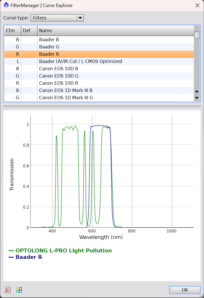
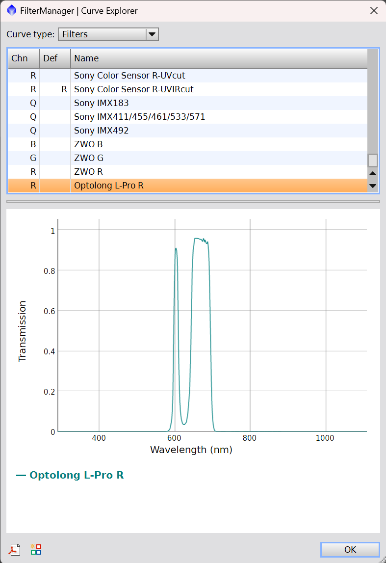
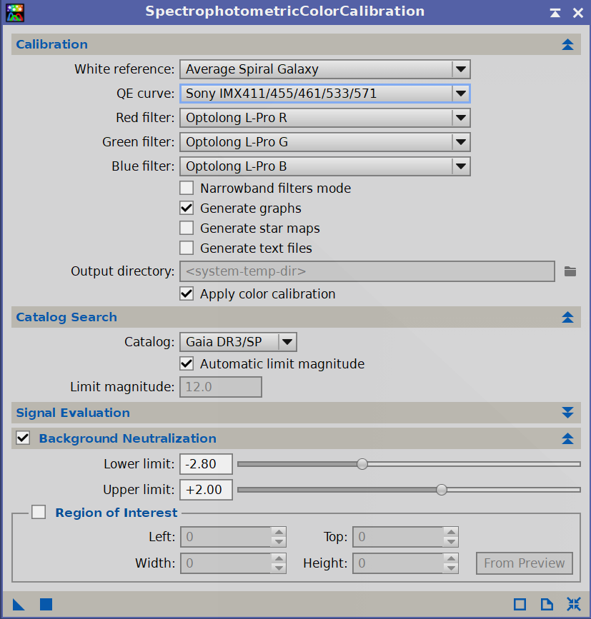
Even in the reprocessed image your color balance is way off, slewed far too much to blue. Given that you're using the L-Pro, SPCC might not be the best choice for color calibration. I mean, you _could_ try to model the R, G and B components of it by using the FilterManager process. Open up that process and click the Curve Explorer button. When you do, you get this: 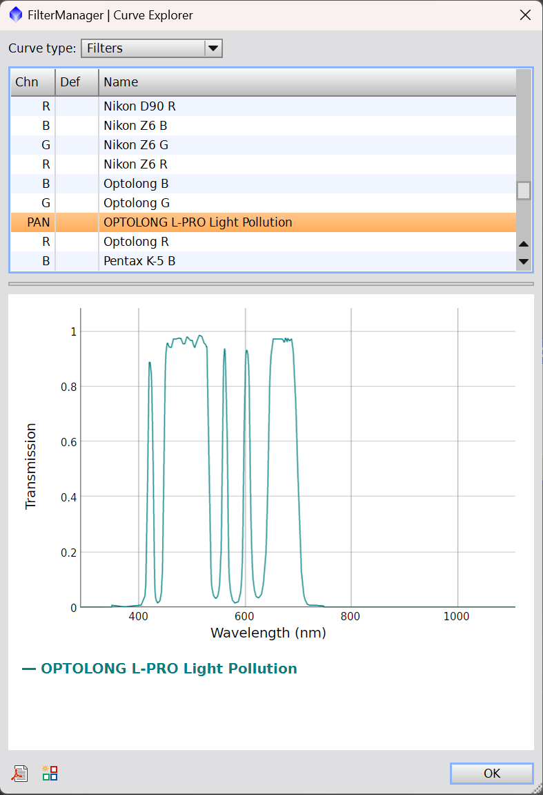 As you can see, they have the L-Pro modeled. Now scroll through and control-click on some R filter. I picked the Baader R filter because it gave the most complete coverage of the R spectrum also covered by the L-Pro. When you do, you'll see both graphs overlapping:  Now you click that icon next to the PDF and it pops up a save dialog: 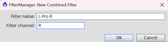 Enter a name (I chose L-Pro R) and the channel (in this case R) and click OK. You'll have the new filter:  Repeat the same for the G and B channels: 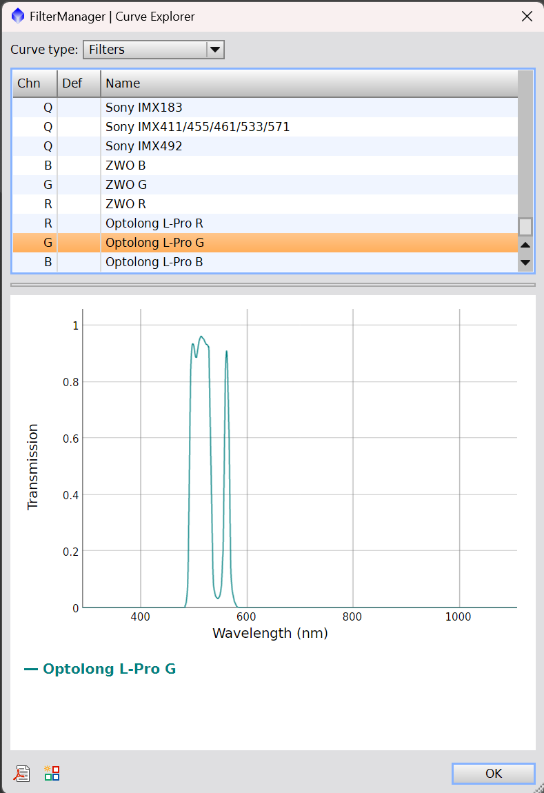 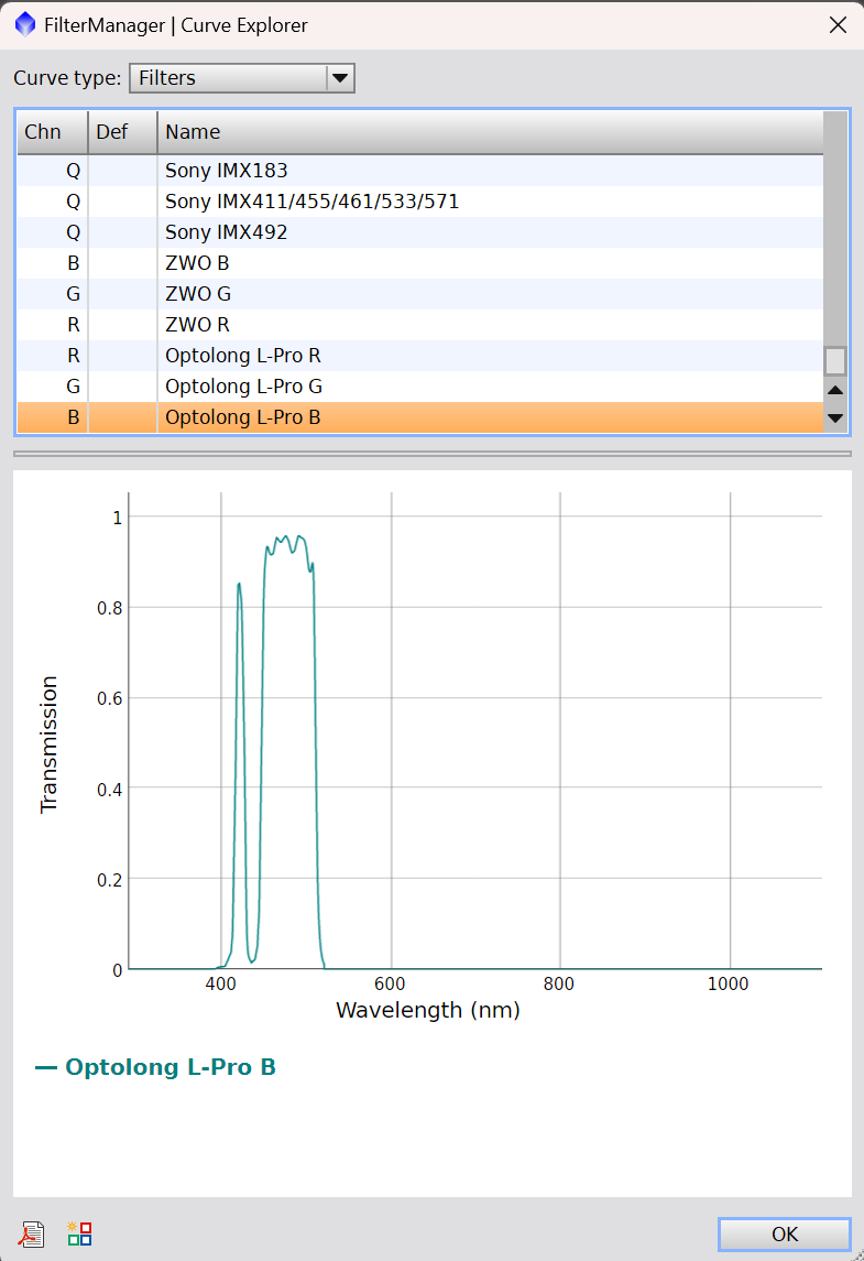 Once done, click OK and then choose "Yes" to save them when prompted. Now, when you open SPCC, you can choose your newly created filters:  Running SPCC now should give you a better color balance from which to start  .
|
You cannot like this item. Reason: "ANONYMOUS".
You cannot remove your like from this item.
Editing a post is only allowed within 24 hours after creating it.
You cannot Like this post because the topic is closed.
Copy the URL below to share a direct link to this post.
This post cannot be edited using the classic forums editor.
To edit this post, please enable the "New forums experience" in your settings.
Jonny Bravo:
Even in the reprocessed image your color balance is way off, slewed far too much to blue. Given that you're using the L-Pro, SPCC might not be the best choice for color calibration. I mean, you _could_ try to model the R, G and B components of it by using the FilterManager process. Open up that process and click the Curve Explorer button.
When you do, you get this:
As you can see, they have the L-Pro modeled. Now scroll through and control-click on some R filter. I picked the Baader R filter because it gave the most complete coverage of the R spectrum also covered by the L-Pro. When you do, you'll see both graphs overlapping:
Now you click that icon next to the PDF and it pops up a save dialog:
Enter a name (I chose L-Pro R) and the channel (in this case R) and click OK. You'll have the new filter:
Repeat the same for the G and B channels:
Once done, click OK and then choose "Yes" to save them when prompted. Now, when you open SPCC, you can choose your newly created filters:
Running SPCC now should give you a better color balance from which to start . Wow! This is incredibly helpful stuff here. I can’t wait to try this out. I really appreciate the thought and effort you put into this response. Many thanks!
|
You cannot like this item. Reason: "ANONYMOUS".
You cannot remove your like from this item.
Editing a post is only allowed within 24 hours after creating it.
You cannot Like this post because the topic is closed.
Copy the URL below to share a direct link to this post.
This post cannot be edited using the classic forums editor.
To edit this post, please enable the "New forums experience" in your settings.
Alex Nicholas:
if I were to offer anything in the way of constructive criticim, it would be
1. It still looks a little blue, and while I know the reflection nebula is blue due to its illuminating stars, I'd say what I mean is, its a very deep, rich blue, where I would expect a more light, airy, almost sky blue.
2. The stars look quite desaturated by comparison to the nebula...
Typically, I find, especially with big bright targets like this, that if you boost the saturation of the of the nebulosity, you need to push the saturation on the stars even harder, or their colour becomes quite subdued against the target... The giveaway on your star colours are HD23609 and HD23654 (two stars in the row of stars pointing inward toward the center of the pleades) those two stars are quite distinctly orange/red, and in your image, you can see a hint of that colour - but the stars are quite dull colour wise.
I would just hit them with a saturation curve adjustment prior to rescreening them into the image... Typically, you will need to push their saturation harder than you think at first... Thanks Alex! I'm going to spend some time working on that color balance and pay attention to the star colors. This is very helpful. I'll have to upgrade my membership to get another revision in. |
You cannot like this item. Reason: "ANONYMOUS".
You cannot remove your like from this item.
Editing a post is only allowed within 24 hours after creating it.
You cannot Like this post because the topic is closed.
Copy the URL below to share a direct link to this post.
This post cannot be edited using the classic forums editor.
To edit this post, please enable the "New forums experience" in your settings.
I took everyone's suggestions and did a quick reprocess of the image and added it as a revision. I created the custom filters for SPCC, which I think really helped (Thanks Jonny). I also increased the color saturation of the stars and tried to get the nebulosity to that airy sky blue that Alex mentioned as opposed to the deep, dark blue that I had before. 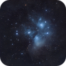
M45 |
You cannot like this item. Reason: "ANONYMOUS".
You cannot remove your like from this item.
Editing a post is only allowed within 24 hours after creating it.
You cannot Like this post because the topic is closed.
Copy the URL below to share a direct link to this post.
This post cannot be edited using the classic forums editor.
To edit this post, please enable the "New forums experience" in your settings.
Brion Pellarin:
I took everyone's suggestions and did a quick reprocess of the image and added it as a revision.
I created the custom filters for SPCC, which I think really helped (Thanks Jonny). I also increased the color saturation of the stars and tried to get the nebulosity to that airy sky blue that Alex mentioned as opposed to the deep, dark blue that I had before.
M45 That looks FAR better, Brion! Great work!
|
You cannot like this item. Reason: "ANONYMOUS".
You cannot remove your like from this item.
Editing a post is only allowed within 24 hours after creating it.
You cannot Like this post because the topic is closed.
Copy the URL below to share a direct link to this post.
This post cannot be edited using the classic forums editor.
To edit this post, please enable the "New forums experience" in your settings.
Beautiful. My final remark would be to look at the color of your background (so, the “black” part). I think that is still somewhat too blue. And that takes away some of the contrast with the blue of the nebulosity.
But very nicely done!
|
You cannot like this item. Reason: "ANONYMOUS".
You cannot remove your like from this item.
Editing a post is only allowed within 24 hours after creating it.
You cannot Like this post because the topic is closed.
Copy the URL below to share a direct link to this post.
This post cannot be edited using the classic forums editor.
To edit this post, please enable the "New forums experience" in your settings.
Otherwise nice, but your color balance / temperature is off.
M45 is a more subtle blue in reality and the surrounding dust is not blue at all.
Not to toot my own horn, but I've an image with more realistic colors on my page.
|
You cannot like this item. Reason: "ANONYMOUS".
You cannot remove your like from this item.
Editing a post is only allowed within 24 hours after creating it.
You cannot Like this post because the topic is closed.
Copy the URL below to share a direct link to this post.
This post cannot be edited using the classic forums editor.
To edit this post, please enable the "New forums experience" in your settings.
Nooa Jutila:
Not to toot my own horn, but I've an image with more realistic colors on my page. Respectfully disagree...
|
You cannot like this item. Reason: "ANONYMOUS".
You cannot remove your like from this item.
Editing a post is only allowed within 24 hours after creating it.
You cannot Like this post because the topic is closed.
Copy the URL below to share a direct link to this post.
This post cannot be edited using the classic forums editor.
To edit this post, please enable the "New forums experience" in your settings.
Alex Nicholas:
Nooa Jutila:
Not to toot my own horn, but I've an image with more realistic colors on my page.
Respectfully disagree... You are correct, my laptop has bad color accuracy and it looked like the entire image had a blue wash. It looks much better on my phone.
|
You cannot like this item. Reason: "ANONYMOUS".
You cannot remove your like from this item.
Editing a post is only allowed within 24 hours after creating it.
You cannot Like this post because the topic is closed.
Copy the URL below to share a direct link to this post.
This post cannot be edited using the classic forums editor.
To edit this post, please enable the "New forums experience" in your settings.
Thankfully, Pleiades Software have a Pleiades SPCC example in their online documentation: https://pixinsight.com/doc/docs/SPCC/SPCC.html#__Applying_SPCC_to_Broadband_Images_:_Broadband_Calibration_Examples__. Have a look if you want to get an idea of the """proper""" broadband colors. The SPCC documentation page is long and math-heavy, but it has some other nice examples by the way.
|
You cannot like this item. Reason: "ANONYMOUS".
You cannot remove your like from this item.
Editing a post is only allowed within 24 hours after creating it.
You cannot Like this post because the topic is closed.
Copy the URL below to share a direct link to this post.
This post cannot be edited using the classic forums editor.
To edit this post, please enable the "New forums experience" in your settings.
Thank you everyone for all your help with this image! This was a fun experience to get such great advice - it will help me with future work for sure.
I look forward to doing it again some time.
|
You cannot like this item. Reason: "ANONYMOUS".
You cannot remove your like from this item.
Editing a post is only allowed within 24 hours after creating it.
You cannot Like this post because the topic is closed.
Copy the URL below to share a direct link to this post.
This post cannot be edited using the classic forums editor.
To edit this post, please enable the "New forums experience" in your settings.
Nice posts, it will help me in future if i image broadbanding from my Bortle 8/9.
|
You cannot like this item. Reason: "ANONYMOUS".
You cannot remove your like from this item.
Editing a post is only allowed within 24 hours after creating it.
You cannot Like this post because the topic is closed.
Copy the URL below to share a direct link to this post.
This post cannot be edited using the classic forums editor.
To edit this post, please enable the "New forums experience" in your settings.
Die Launische Diva:
Thankfully, Pleiades Software have a Pleiades SPCC example in their online documentation: https://pixinsight.com/doc/docs/SPCC/SPCC.html#__Applying_SPCC_to_Broadband_Images_:_Broadband_Calibration_Examples__. Have a look if you want to get an idea of the """proper""" broadband colors. The SPCC documentation page is long and math-heavy, but it has some other nice examples by the way. The key to the usage of SPCC in their representation of the Pleaides is the white reference. SPCC by default uses "average spiral galaxy" as the basis for white. Since the main stars of the Pleaides are far bluer than white, by using the default, you get the typical blue representation of the data. If, instead, you use the spectral emission of the main stars in the Pleaides as white, you get a much different result. I don't know if I'd call that representation the "proper" broadband colors. It's just using a different white reference point.
|
You cannot like this item. Reason: "ANONYMOUS".
You cannot remove your like from this item.
Editing a post is only allowed within 24 hours after creating it.
You cannot Like this post because the topic is closed.
Copy the URL below to share a direct link to this post.
This post cannot be edited using the classic forums editor.
To edit this post, please enable the "New forums experience" in your settings.
Personally, I think the blue color is a bit over saturated and the black level is clipped a little too much. Otherwise I think it is a pretty decent rendition. Also, as with many objects, I recommend more integration time. There is a good amount of dust surrounding M45 which I think may have been clipped with the black level ( https://www.astrobin.com/s3w397/?nc=&nce=). I am seeing a little bit of the dust in your image but it is really dark.
|
You cannot like this item. Reason: "ANONYMOUS".
You cannot remove your like from this item.
Editing a post is only allowed within 24 hours after creating it.
You cannot Like this post because the topic is closed.
Copy the URL below to share a direct link to this post.
This post cannot be edited using the classic forums editor.
To edit this post, please enable the "New forums experience" in your settings.