![]() ...
·
![]() |
---|
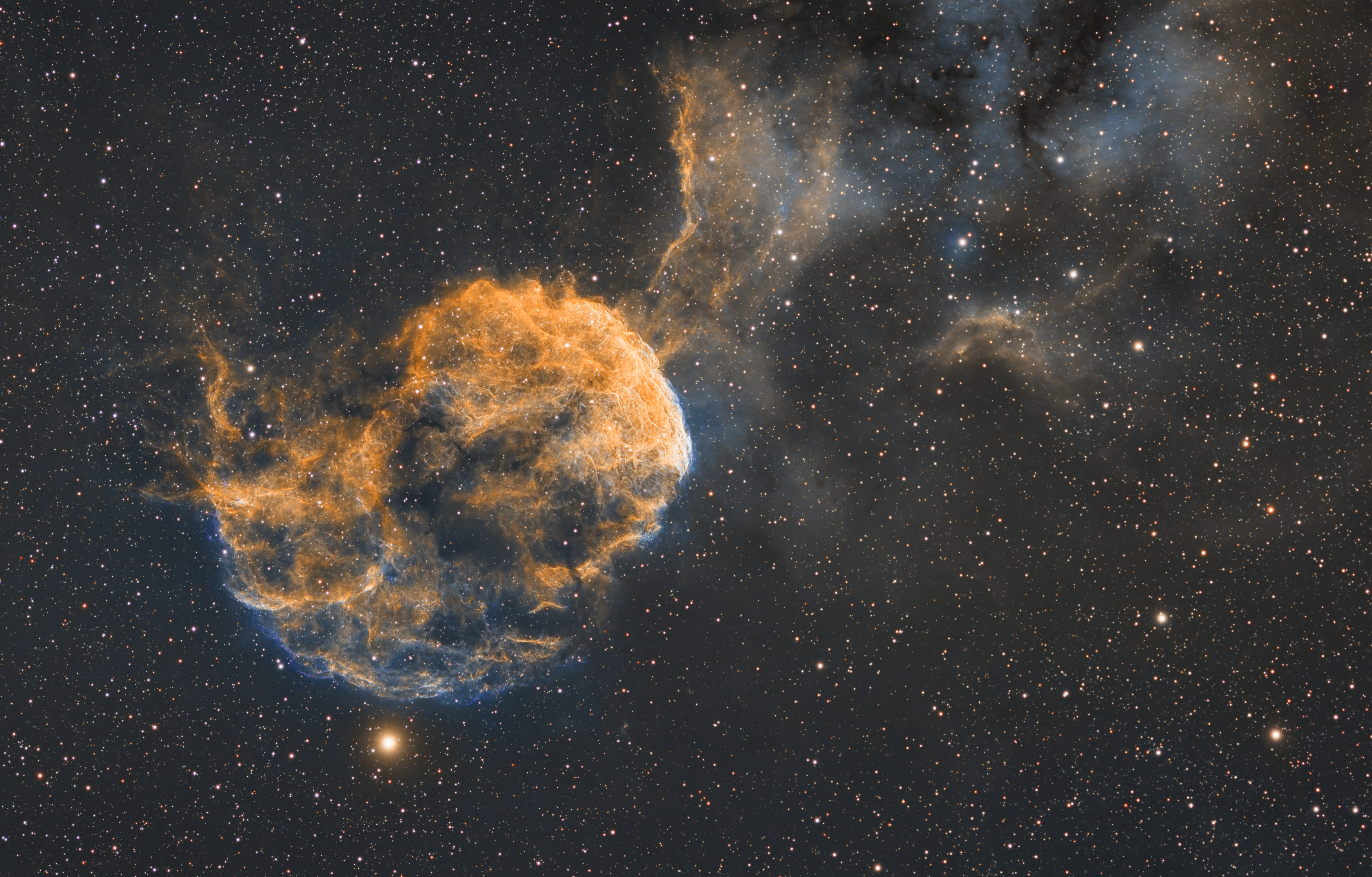
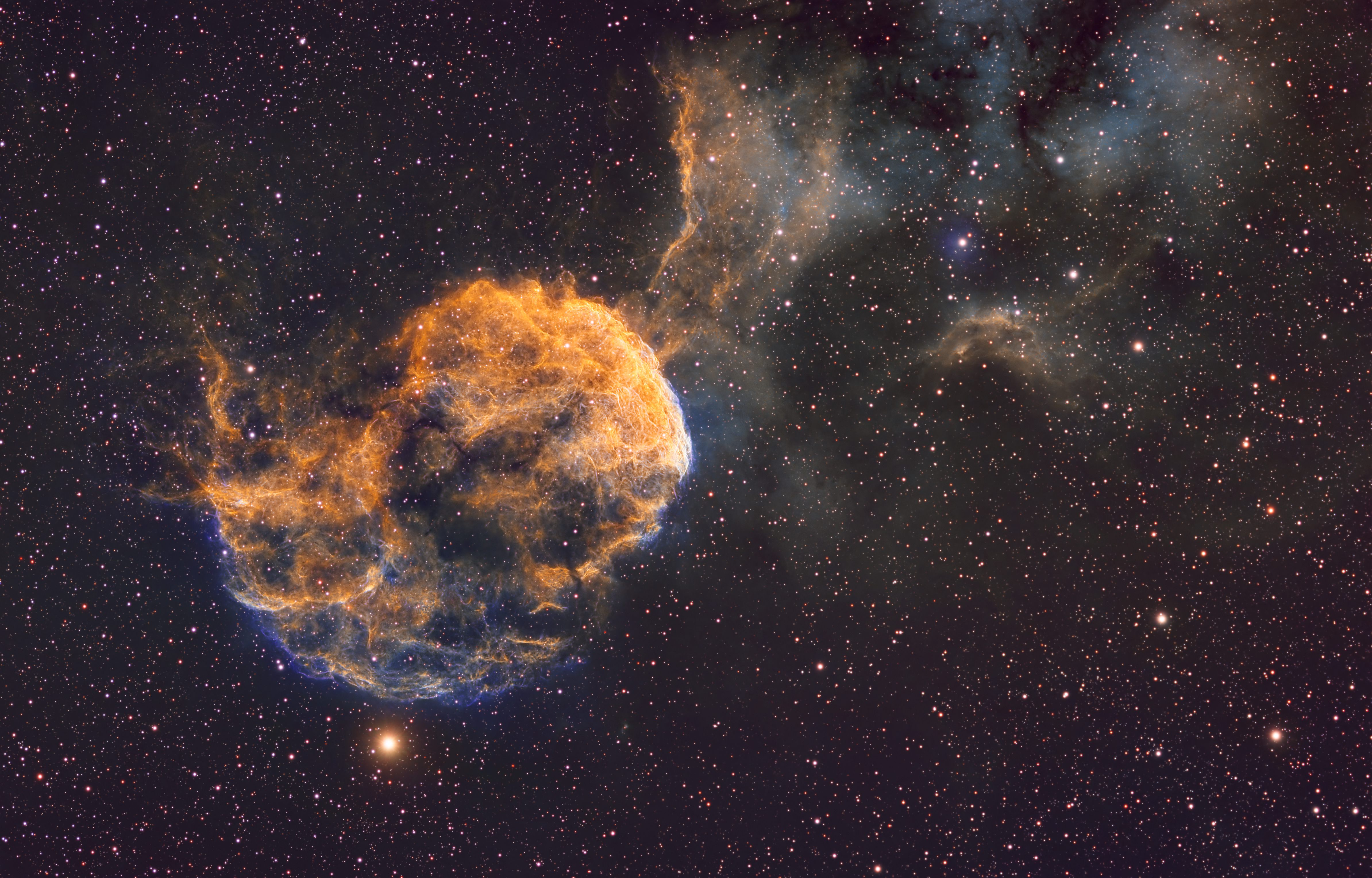
I’ve been doing astrophotography for about three years and have been looking to improve my image quality. I welcome honest critique of my jellyfish image. Thank you in advance! https://app.astrobin.com/u/Scottchambers24?i=b4fdhk#gallery |
![]() ...
·
![]() |
---|
Personally I'm not a fan of the magenta cast on the whole image, but I don't mind the colors of the object itself. It's mainly the hue of the background. Besides that I would say it's slightly over sharpened and overdone with the noise reduction. Of course it depends on your bortle level, but 26 hours should be quite a bit to get a fairly low noise image straight from the stack. Last, it needed to be cropped a touch tighter. In the extreme corners and to some extent along the whole top edge of the image there's a bit of blue noise I'll call it where I'm guessing it's stacking artifact. Overall I would say it is a nice image, and it feels like a bit of a nit picky critique, but there are a lot of Jellyfish posted, so it's hard to stand out from the rest. |
![]() ...
·
![]() |
---|
Thanks! Those are very helpful critiques.
|
![]() ...
·
![]()
·
1
like
|
---|
1. over sharpened (looks like too much PI UnsharpMask or something like that) 2. background color balance is off, it should be grey, not purple, and maybe a touch darker 3. color palette looks unappetizing, but that's highly subjective (to me it has an excessive amount of mustard yellow) 4. stars are not pretty, the cores are too big across the whole image; could use less HT stretching and some more Arcsinh (afterwards), so you don't blow up the stars as much 5. probably should've left in some more luminance noise (the new NXT version allows you to denoise luminance and chrominance separately) I think that's all, just my opinion ![]() |
![]() ...
·
![]()
·
1
like
|
---|
Really appreciate your thoughts - these are the small details I am looking to improve.
|
![]() ...
·
![]()
·
3
likes
|
---|
First of all this is a good image with seemingly very good data behind it. I think generally you did a good job and with a few minor tweaks to processing it can become an excellent image. 1. The first thing I notice is that the background isn't neutral. I'm all for any palette you want to use, I love interesting coloring of narrowband, but the one rule you can't (generally) break on coloring is that the background has to be neutral. You can use BackgroundNeutralization to fix this and/or adjust the channels with HistogramTransformation or CurvesTransformation. This kind of thing usually happens either because of the initial blend of the data or because you tweak individual color channels too much. Easy fix. 2. There seems to be oversharpening, of possibly two types. The stars look a little bit oversharpened with BlurX which limits the color you can get from the awesome RGB star images you took (I prefer to replace stars using unsharpened RGB stars). If you do want to sharpen the stars I'd reduce the amount some and allow a little halo for colors. Presently they're all core. That's probably a matter of taste, though, so really the thing I'd focus on more with sharpening is it looks like you did a final pass of sharpening before posting that overdid it with unsharp mask or photoshop type sharpening. You can see this most clearly in the nebulous "line" leading away from the head of the Jellyfish towards the top of the image. The head of the Jellyfish shows a bit of evidence that you might have gone too hard with BlurX by a tad as well, but it's hard to say with the later sharpening applied. 3. Similarly to the sharpening you've just very slightly overdone the noise reduction I think. You have a lot of data here, so the noise is probably pretty well controlled to start with. If you've previously done shorter integrations and are trying to improve you images with more integration you may have used something more along the lines of the amount of NoiseX you would've needed previously on less deep data. Generally I like to back off the noise reduction to the point I can just barely start seeing the grain at full magnification. In that way you know you've gone all the way to the edge, but not over it. I don't see any obvious signs that you went so overboard that you lost detail from the noise reduction and it doesn't make the background look "plastic" yet, so you were likely very very close to the right level and there would even be an argument that maybe it wasn't too much depending on taste. 4. As a consequence of #2, you lost some of your star color. You went to the trouble to take nice RGB star images, so I think you can get a little more value out of that time by changing your star processing a bit. There are a lot of ways to get nice stars. You can stretch the cores (HT or something "normal") and halos (arcsinh stretch) separately, you can use GHS to target the stretch, you can use the StarStretch script, etc. You'll want to play around and find your style. My personal approach is to not run BlurX on my RGB stars at all since deconvolution will push more brightness to the core of the star. You can use "correct only" in BlurX if you have the stars and need to fix star shapes for whatever reason but don't want it to mess with the intensity. I'm excited to see you progress. You're on the cusp of having really excellent images. I looked at some of your other images which were also quite good. I look forward to seeing what you produce. |
![]() ...
·
![]() |
---|
Kyle, Wow, thanks so much for all the amazing feedback. I appreciate you taking the time to analyze my image and offer some great feedback. I'll be taking into account your advice and offering some edited photos in the near future! Clear skies! Scott |
![]() ...
·
![]()
·
1
like
|
---|
Kyle, So after some reprocessing attempts I think I have a version that addresses the issues you pointed out. On my original I definitely saw the red cast in the background along with the overdone noise reduction. This one has a neutral background (that I can tell from my computer screen), perhaps less sharpening, a lot less noise reduction, plus much better stars. In this case, instead of using seti astro's star stretch I did them by hand using HT and arcsinhstretch. I think they turned out way better. The larger version I revised on my actual post but here is a jpeg for easy viewing. Appreciate the feedback! IC443 Final (Version 2).jpg |