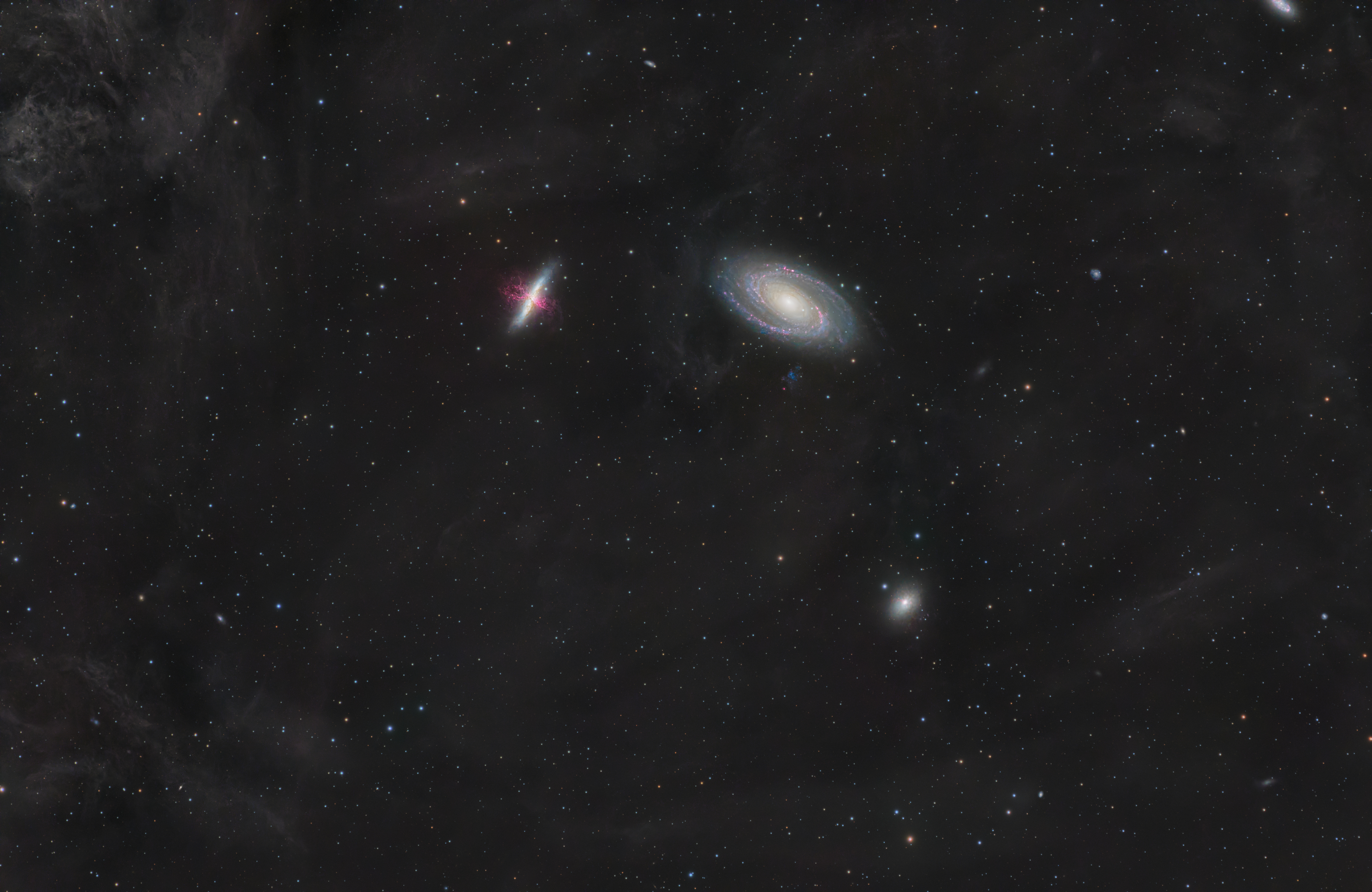
Hello everybody, ive recently finished one of my largest projects yet, a 115h integration of Bodes Galaxy in HaLRGB, and I was looking for some criticism, because sometimes im blind to some problems Ive done in my editing, was looking to get some fresh set of eyes on my image. constructive critique is very welcome, also if you find something that I did well, let me know aswell. here is the astrobin link aswell https://app.astrobin.com/u/EnVY?i=7rgtf8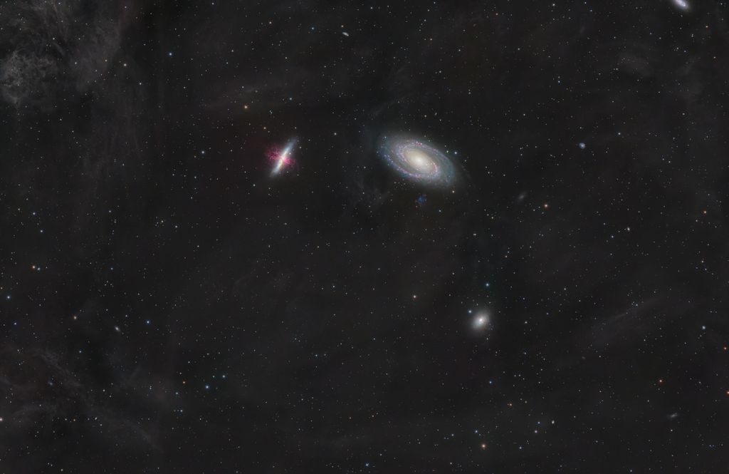 let me know what you think of it! CS Claudio
|
You cannot like this item. Reason: "ANONYMOUS".
You cannot remove your like from this item.
Editing a post is only allowed within 24 hours after creating it.
You cannot Like this post because the topic is closed.
Copy the URL below to share a direct link to this post.
This post cannot be edited using the classic forums editor.
To edit this post, please enable the "New forums experience" in your settings.
Weird colors, poor stars and overall coarse details. Denoising applied far too heavily may have contributed to the coarseness of the details.
|
You cannot like this item. Reason: "ANONYMOUS".
You cannot remove your like from this item.
Editing a post is only allowed within 24 hours after creating it.
You cannot Like this post because the topic is closed.
Copy the URL below to share a direct link to this post.
This post cannot be edited using the classic forums editor.
To edit this post, please enable the "New forums experience" in your settings.
andrea tasselli:
Weird colors, poor stars and overall coarse details. Denoising applied far too heavily may have contributed to the coarseness of the details. in what way wierd colors? you mean in the galaxy?
|
You cannot like this item. Reason: "ANONYMOUS".
You cannot remove your like from this item.
Editing a post is only allowed within 24 hours after creating it.
You cannot Like this post because the topic is closed.
Copy the URL below to share a direct link to this post.
This post cannot be edited using the classic forums editor.
To edit this post, please enable the "New forums experience" in your settings.
Yes, both galaxies and the overall hue of the dust veering toward purple. Stars colors are either pale blue or pale yellow and I'm pretty sure there aren't that many of those spectral kind over there. Star shapes are a bit off.
|
You cannot like this item. Reason: "ANONYMOUS".
You cannot remove your like from this item.
Editing a post is only allowed within 24 hours after creating it.
You cannot Like this post because the topic is closed.
Copy the URL below to share a direct link to this post.
This post cannot be edited using the classic forums editor.
To edit this post, please enable the "New forums experience" in your settings.
andrea tasselli:
Yes, both galaxies and the overall hue of the dust veering toward purple. Stars colors are either pale blue or pale yellow and I'm pretty sure there aren't that many of those spectral kind over there. Star shapes are a bit off. got it, thanks!
|
You cannot like this item. Reason: "ANONYMOUS".
You cannot remove your like from this item.
Editing a post is only allowed within 24 hours after creating it.
You cannot Like this post because the topic is closed.
Copy the URL below to share a direct link to this post.
This post cannot be edited using the classic forums editor.
To edit this post, please enable the "New forums experience" in your settings.
andrea tasselli:
Yes, both galaxies and the overall hue of the dust veering toward purple. Stars colors are either pale blue or pale yellow and I'm pretty sure there aren't that many of those spectral kind over there. Star shapes are a bit off. how would I go on changing the star colours to get them better? also what do you think of the overall hue of the dust now? is this better? 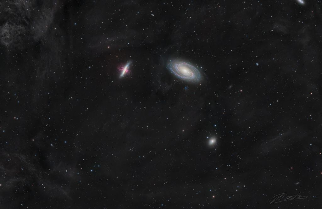 |
You cannot like this item. Reason: "ANONYMOUS".
You cannot remove your like from this item.
Editing a post is only allowed within 24 hours after creating it.
You cannot Like this post because the topic is closed.
Copy the URL below to share a direct link to this post.
This post cannot be edited using the classic forums editor.
To edit this post, please enable the "New forums experience" in your settings.
Dust is much better now. Blotchy and weird colors for the parts of the image are still there though. As for star and their colors I assume that if you run SPCC with just the RGB stars you'll get the right response. Not sure whether you have BXT which would improve upon stars shapes and lateral color dramatically.
|
You cannot like this item. Reason: "ANONYMOUS".
You cannot remove your like from this item.
Editing a post is only allowed within 24 hours after creating it.
You cannot Like this post because the topic is closed.
Copy the URL below to share a direct link to this post.
This post cannot be edited using the classic forums editor.
To edit this post, please enable the "New forums experience" in your settings.
The star shapes are not great. It looks like there are significant aberrations. I might start the star processing with a “correct only” pass of BlurX. The galaxies have something destroying the detail and making them look funny generally, probably excessive denoising. There is some CA or at least longitudinal fringing on the white/blue stars. The framing is also odd, with a conspicuous cutting off of a galaxy or something on the top right. The crop should exclude that object entirely if it can’t include it entirely.
|
You cannot like this item. Reason: "ANONYMOUS".
You cannot remove your like from this item.
Editing a post is only allowed within 24 hours after creating it.
You cannot Like this post because the topic is closed.
Copy the URL below to share a direct link to this post.
This post cannot be edited using the classic forums editor.
To edit this post, please enable the "New forums experience" in your settings.
I’m on my phone, so I can’t really look at the little details like star colors and shapes, but I like the galaxies and the Ha incorporated in to the image.
Going back to the data acquisition phase, I would have taken maybe 20 hours less of the Ha filter and used that for lum instead. My reason for that is because for such a wide field of view, the image is rather bland. I think more luminance would have allowed you to get more IFN which would really make the image.
|
You cannot like this item. Reason: "ANONYMOUS".
You cannot remove your like from this item.
Editing a post is only allowed within 24 hours after creating it.
You cannot Like this post because the topic is closed.
Copy the URL below to share a direct link to this post.
This post cannot be edited using the classic forums editor.
To edit this post, please enable the "New forums experience" in your settings.
Quinn Groessl:
I’m on my phone, so I can’t really look at the little details like star colors and shapes, but I like the galaxies and the Ha incorporated in to the image.
Going back to the data acquisition phase, I would have taken maybe 20 hours less of the Ha filter and used that for lum instead. My reason for that is because for such a wide field of view, the image is rather bland. I think more luminance would have allowed you to get more IFN which would really make the image. yes I agree on that point, I only have so much Ha, because I had a week of clear skies where the moon was out. Couldn't really shoot any luminance in that time period. but I agree completely, I might even try to get some luminance when the skies clear up again, but ive been on this image for almost 2 months, I wanted to start editing it, see what comes out, and also that was my first time actually adding Ha to a LRGB image, so im pretty happy about how it came out too.
|
You cannot like this item. Reason: "ANONYMOUS".
You cannot remove your like from this item.
Editing a post is only allowed within 24 hours after creating it.
You cannot Like this post because the topic is closed.
Copy the URL below to share a direct link to this post.
This post cannot be edited using the classic forums editor.
To edit this post, please enable the "New forums experience" in your settings.
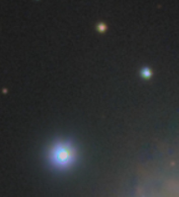
correct only gives me some strange artefacts on the stars, left is before, on the right is after. 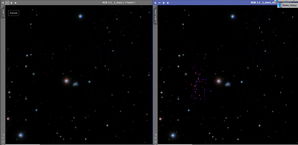 im guessing that these are because it was used on a non linear image.
|
You cannot like this item. Reason: "ANONYMOUS".
You cannot remove your like from this item.
Editing a post is only allowed within 24 hours after creating it.
You cannot Like this post because the topic is closed.
Copy the URL below to share a direct link to this post.
This post cannot be edited using the classic forums editor.
To edit this post, please enable the "New forums experience" in your settings.
Yes, blurX only works properly on linear images. The psf, on which it relies, is destroyed by stretching.
|
You cannot like this item. Reason: "ANONYMOUS".
You cannot remove your like from this item.
Editing a post is only allowed within 24 hours after creating it.
You cannot Like this post because the topic is closed.
Copy the URL below to share a direct link to this post.
This post cannot be edited using the classic forums editor.
To edit this post, please enable the "New forums experience" in your settings.
My comment is more from a photographic/art point of view. My question for you to think about would be, what's the main subject? Is it the IFN or is it the group of galaxies? I see losts of images like this where people want to include everything they can. Honestly, that bright clump of IFN in the upper left corner is is drawing the eye away from the galaxies resulting in a confused composition. I would consider cropping in on the main group of galaxies and not worry so much about the IFN. Doing that would make a stronger image with more visual impact.
|
You cannot like this item. Reason: "ANONYMOUS".
You cannot remove your like from this item.
Editing a post is only allowed within 24 hours after creating it.
You cannot Like this post because the topic is closed.
Copy the URL below to share a direct link to this post.
This post cannot be edited using the classic forums editor.
To edit this post, please enable the "New forums experience" in your settings.
Claudio Boicu:
correct only gives me some strange artefacts on the stars, left is before, on the right is after.
im guessing that these are because it was used on a non linear image. Right after stacking, ideally you don't manipulate the data at all until you're done with those steps: 1- If mono, LinearFit each channel to the statistically brightest (Process -> Statistics for the actual median/average), then ChannelCombine to RGB. If color camera, you're already in RGB. 2- DBE / your favorite background gradient removal tool 3- BXT correct only 4- SPCC 5- BXT sharpening 6- The rest of your workflow This is the ideal BXT workflow as described by the author. Correct only, SPCC, then sharpen as early as possible. Correcting your stars before SPCC will help SPCC get the right flux from your stars. P.S.: Your image kick ass overall. You're in the minor details refinement now.
|
You cannot like this item. Reason: "ANONYMOUS".
You cannot remove your like from this item.
Editing a post is only allowed within 24 hours after creating it.
You cannot Like this post because the topic is closed.
Copy the URL below to share a direct link to this post.
This post cannot be edited using the classic forums editor.
To edit this post, please enable the "New forums experience" in your settings.
I wish BXT would have better CA correction, I've been noticing it's a bit weak at correcting that
hopefully the next BXT version will have that
the CA is depressingly obvious in my latest M45 image, there was no way to remove it (even BXT correct run + another run with 0.50 sharpen doesn't help that much); I would think F/6.4 with some ED elements in a petzval config would not have much CA, but I guess not; you get what you pay for…
EDIT: I did try correcting with photoshop fringe tools, but you can still see the star colors are not uniform, especially towards the corners of the image
|
You cannot like this item. Reason: "ANONYMOUS".
You cannot remove your like from this item.
Editing a post is only allowed within 24 hours after creating it.
You cannot Like this post because the topic is closed.
Copy the URL below to share a direct link to this post.
This post cannot be edited using the classic forums editor.
To edit this post, please enable the "New forums experience" in your settings.
Tony Gondola:
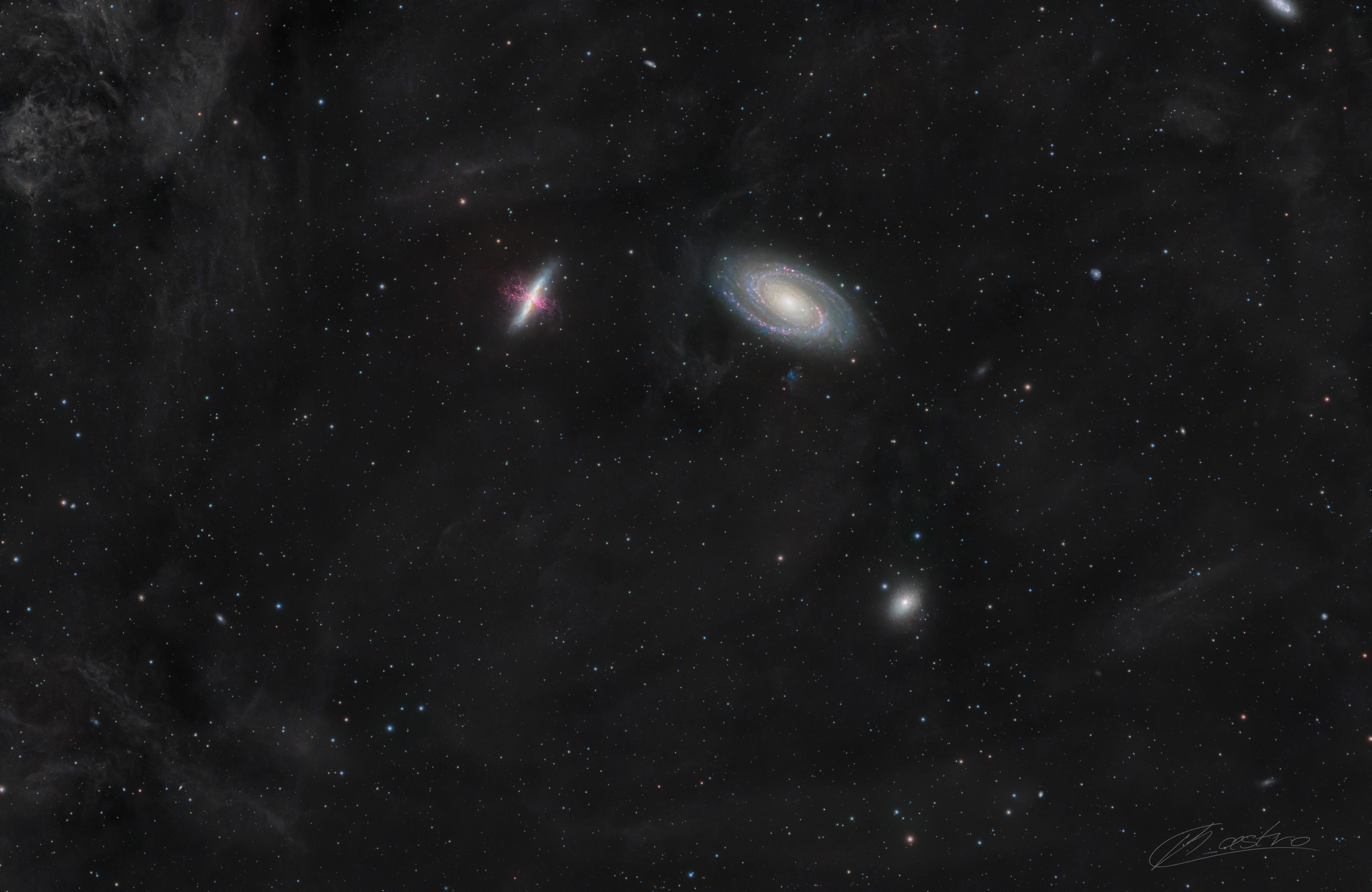
My comment is more from a photographic/art point of view. My question for you to think about would be, what's the main subject? Is it the IFN or is it the group of galaxies? I see losts of images like this where people want to include everything they can. Honestly, that bright clump of IFN in the upper left corner is is drawing the eye away from the galaxies resulting in a confused composition. I would consider cropping in on the main group of galaxies and not worry so much about the IFN. Doing that would make a stronger image with more visual impact. okay so I cropped a bit in because after looking at it with some fresh set of eyes, I definitely agree with you. also kept the more revision where the dust doesn't steer towards purple that much.
|
You cannot like this item. Reason: "ANONYMOUS".
You cannot remove your like from this item.
Editing a post is only allowed within 24 hours after creating it.
You cannot Like this post because the topic is closed.
Copy the URL below to share a direct link to this post.
This post cannot be edited using the classic forums editor.
To edit this post, please enable the "New forums experience" in your settings.
Miguel T.:
Claudio Boicu:
correct only gives me some strange artefacts on the stars, left is before, on the right is after.
im guessing that these are because it was used on a non linear image.
Right after stacking, ideally you don't manipulate the data at all until you're done with those steps:
1- If mono, LinearFit each channel to the statistically brightest (Process -> Statistics for the actual median/average), then ChannelCombine to RGB. If color camera, you're already in RGB.
2- DBE / your favorite background gradient removal tool
3- BXT correct only
4- SPCC
5- BXT sharpening
6- The rest of your workflow
This is the ideal BXT workflow as described by the author. Correct only, SPCC, then sharpen as early as possible. Correcting your stars before SPCC will help SPCC get the right flux from your stars.
P.S.: Your image kick ass overall. You're in the minor details refinement now. thanks for the workflow addition, will try that the next time. and thank you for the kind words  I was starting to think my image wasn't that good overall, meaning I had to many flaws that distract it from being a generally good image.
|
You cannot like this item. Reason: "ANONYMOUS".
You cannot remove your like from this item.
Editing a post is only allowed within 24 hours after creating it.
You cannot Like this post because the topic is closed.
Copy the URL below to share a direct link to this post.
This post cannot be edited using the classic forums editor.
To edit this post, please enable the "New forums experience" in your settings.
Looking closely at your image there are definitely a few points I'd improve on - Stars:
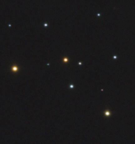
Your star shapes and colours are off. The cores seem to be very clipped, and there's a strange cutoff between the core and the outer colour. You've also got some strange colours; for some stars, one half is green and the other half is yellow. Personally, I use a manual STF stretch applied with histogram to get stars that avoid these issues. I believe the screenshot of your image below accurately represents. I have attached an image of my own stars with my Newtonian which I have stretched with STF / Histo
- Oversharpening
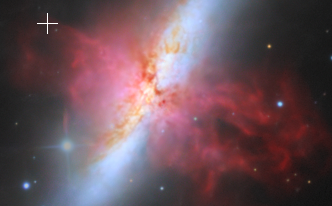
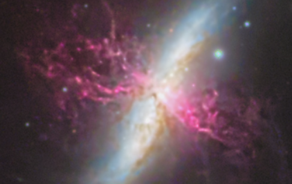
If you take a look at the Ha jet on M82, it's quite clearly over sharpened. I assume you're using something like Blurx or Graxpert Deconvolution. You can tell it's excessive because of the bright blobby structures it seems to take. You should not be pushing your data past what it can handle. Using a good reference image can help you with seeing if you're pushing certain things too far or not. I have provided a comparison between your M82 and my own, which I think effectively highlights the differences.
- M81 colours
It seems that you've done some specific colour masking to try and bring out the colours of M81, but I do not believe that you have done it well. If you take a close look at the spiral arms in M81, you can clearly see distinct shifts in colours which are not continuous:
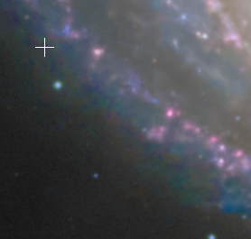
This often comes from improperly saturating your image. I agree that the colours on M81 can be quite hard to get right. A method I like to use which seems to work quite well for me is to use blurred colour masks. Applying a Gaussian blur to your initial colour mask will make the transition much smoother. In addition to this, use a good reference image to see what type of colour the core and spiral should look like.
For the rest, I think that the IFN was brought out well and it's not overstretched.
Hope this advice helps,
Flavio
|
You cannot like this item. Reason: "ANONYMOUS".
You cannot remove your like from this item.
Editing a post is only allowed within 24 hours after creating it.
You cannot Like this post because the topic is closed.
Copy the URL below to share a direct link to this post.
This post cannot be edited using the classic forums editor.
To edit this post, please enable the "New forums experience" in your settings.
Flavio Cicero:
Looking closely at your image there are definitely a few points I'd improve on
- Stars:
Your star shapes and colours are off. The cores seem to be very clipped, and there's a strange cutoff between the core and the outer colour. You've also got some strange colours; for some stars, one half is green and the other half is yellow. Personally, I use a manual STF stretch applied with histogram to get stars that avoid these issues. I believe the screenshot of your image below accurately represents. I have attached an image of my own stars with my Newtonian which I have stretched with STF / Histo
- Oversharpening
If you take a look at the Ha jet on M82, it's quite clearly over sharpened. I assume you're using something like Blurx or Graxpert Deconvolution. You can tell it's excessive because of the bright blobby structures it seems to take. You should not be pushing your data past what it can handle. Using a good reference image can help you with seeing if you're pushing certain things too far or not. I have provided a comparison between your M82 and my own, which I think effectively highlights the differences.
- M81 colours
It seems that you've done some specific colour masking to try and bring out the colours of M81, but I do not believe that you have done it well. If you take a close look at the spiral arms in M81, you can clearly see distinct shifts in colours which are not continuous:
This often comes from improperly saturating your image. I agree that the colours on M81 can be quite hard to get right. A method I like to use which seems to work quite well for me is to use blurred colour masks. Applying a Gaussian blur to your initial colour mask will make the transition much smoother. In addition to this, use a good reference image to see what type of colour the core and spiral should look like.
For the rest, I think that the IFN was brought out well and it's not overstretched.
Hope this advice helps,
Flavio
this helped quite a lot actually, thank you for providing some reference images, and how you handle your stars aswell, I never seem to get them right.
|
You cannot like this item. Reason: "ANONYMOUS".
You cannot remove your like from this item.
Editing a post is only allowed within 24 hours after creating it.
You cannot Like this post because the topic is closed.
Copy the URL below to share a direct link to this post.
This post cannot be edited using the classic forums editor.
To edit this post, please enable the "New forums experience" in your settings.
Claudio Boicu:
Tony Gondola:
My comment is more from a photographic/art point of view. My question for you to think about would be, what's the main subject? Is it the IFN or is it the group of galaxies? I see losts of images like this where people want to include everything they can. Honestly, that bright clump of IFN in the upper left corner is is drawing the eye away from the galaxies resulting in a confused composition. I would consider cropping in on the main group of galaxies and not worry so much about the IFN. Doing that would make a stronger image with more visual impact.
okay so I cropped a bit in because after looking at it with some fresh set of eyes, I definitely agree with you.
also kept the more revision where the dust doesn't steer towards purple that much. Much improved I think.
|
You cannot like this item. Reason: "ANONYMOUS".
You cannot remove your like from this item.
Editing a post is only allowed within 24 hours after creating it.
You cannot Like this post because the topic is closed.
Copy the URL below to share a direct link to this post.
This post cannot be edited using the classic forums editor.
To edit this post, please enable the "New forums experience" in your settings.
Claudio Boicu:
andrea tasselli:
Weird colors, poor stars and overall coarse details. Denoising applied far too heavily may have contributed to the coarseness of the details.
in what way wierd colors? you mean in the galaxy? I think he's saying your stars should be brighter, as they seem slightly dim
|
You cannot like this item. Reason: "ANONYMOUS".
You cannot remove your like from this item.
Editing a post is only allowed within 24 hours after creating it.
You cannot Like this post because the topic is closed.
Copy the URL below to share a direct link to this post.
This post cannot be edited using the classic forums editor.
To edit this post, please enable the "New forums experience" in your settings.
It is great art. It contains more elements of creativity than optically science based images. It is your creation.
|
You cannot like this item. Reason: "ANONYMOUS".
You cannot remove your like from this item.
Editing a post is only allowed within 24 hours after creating it.
You cannot Like this post because the topic is closed.
Copy the URL below to share a direct link to this post.
This post cannot be edited using the classic forums editor.
To edit this post, please enable the "New forums experience" in your settings.
 2.61
2.61

 9.89
9.89
 4.71
4.71
 9.38
9.38

 3.01
3.01
 8.11
8.11
 8.21
8.21
 7.22
7.22
 0.00
0.00


 1.81
1.81
